THE VISUAL LANGUAGE
OF NEW YORK,
THROUGH A BRAND DESIGNER’S EYES
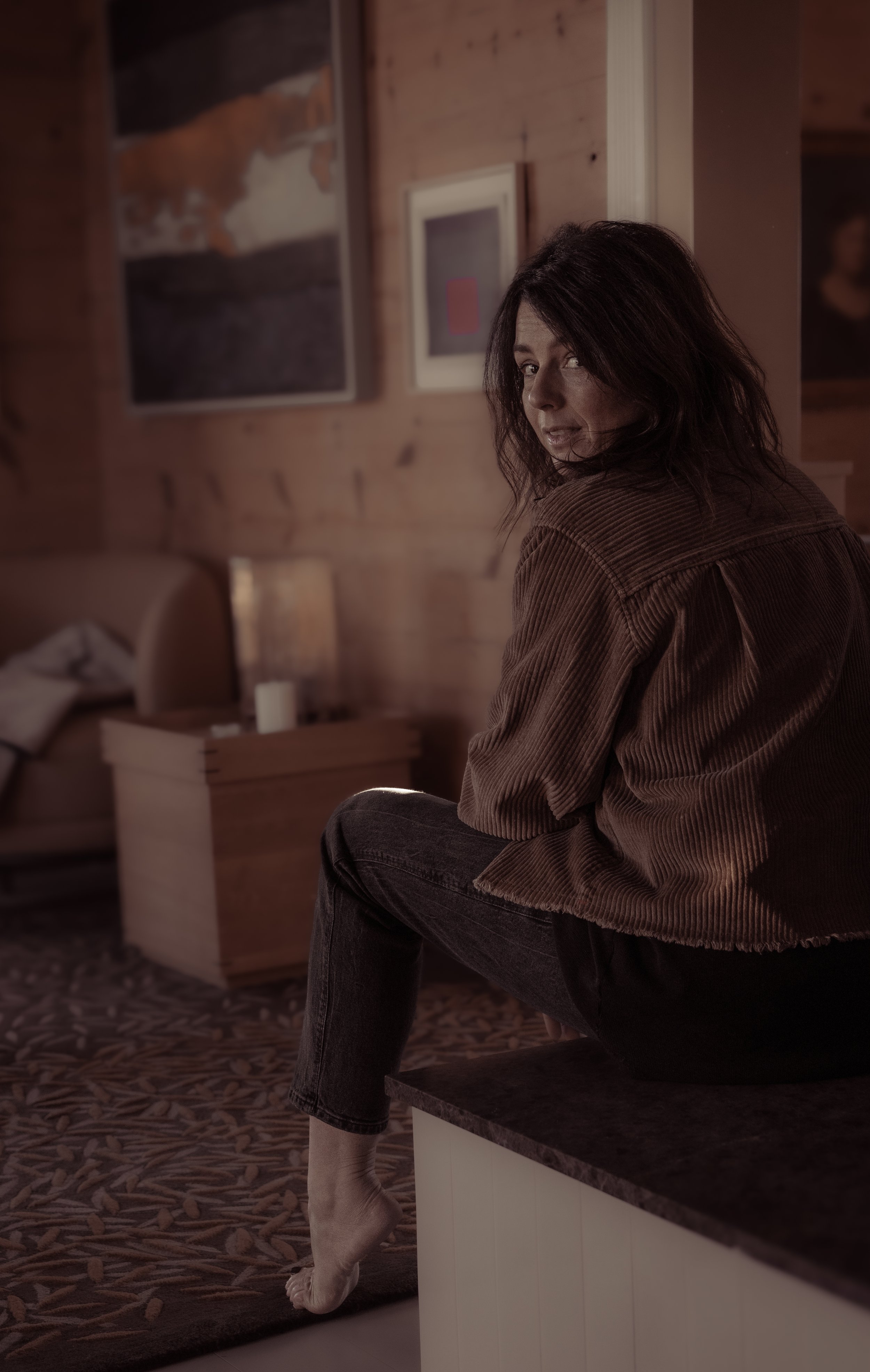
Personal reflections from Clementine,
founder of MUSE Studio.
‘New York is a city of visual contradictions, unexpected details and endless inspiration.”
There are cities you visit, and cities you can’t help but look at.
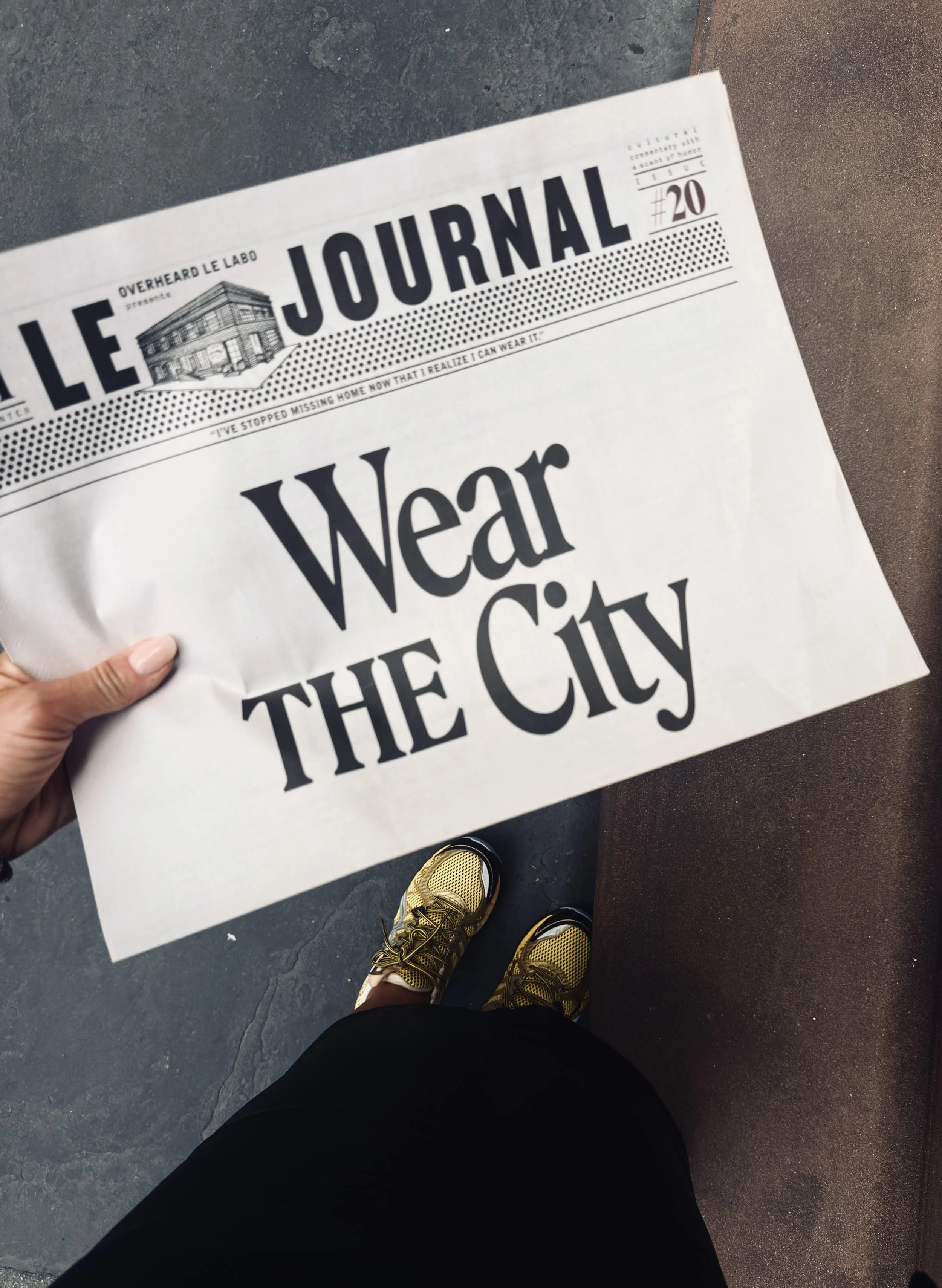
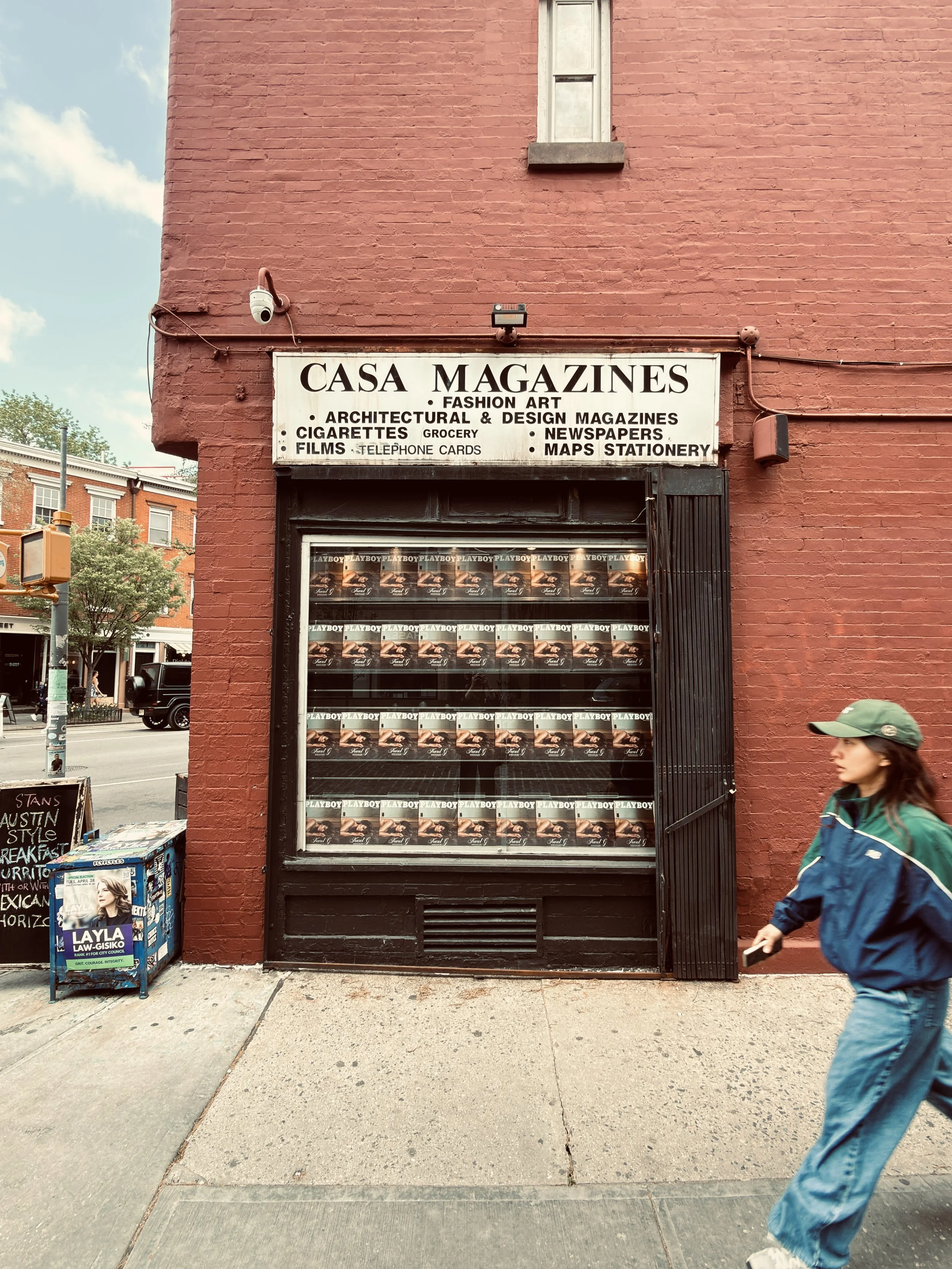
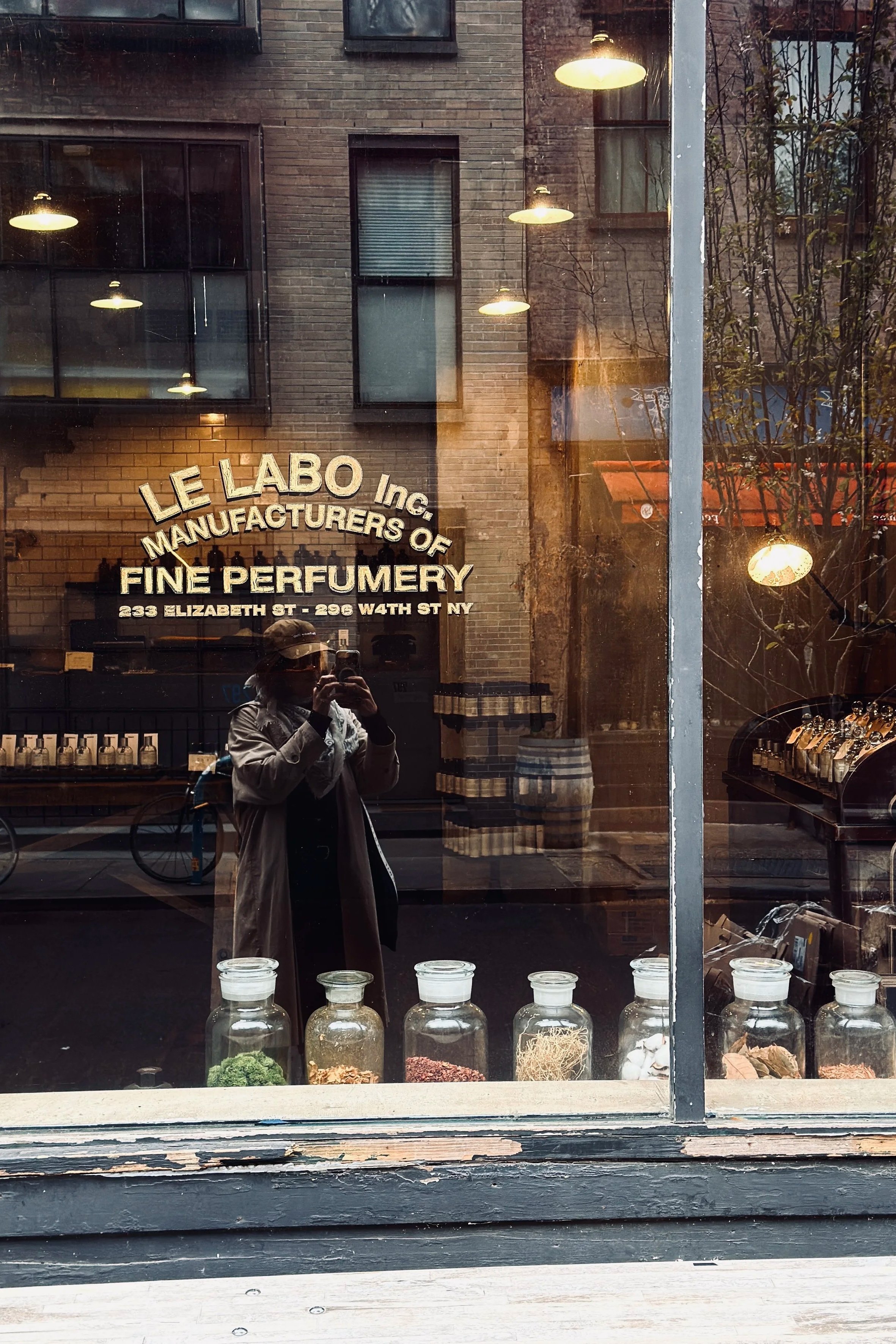
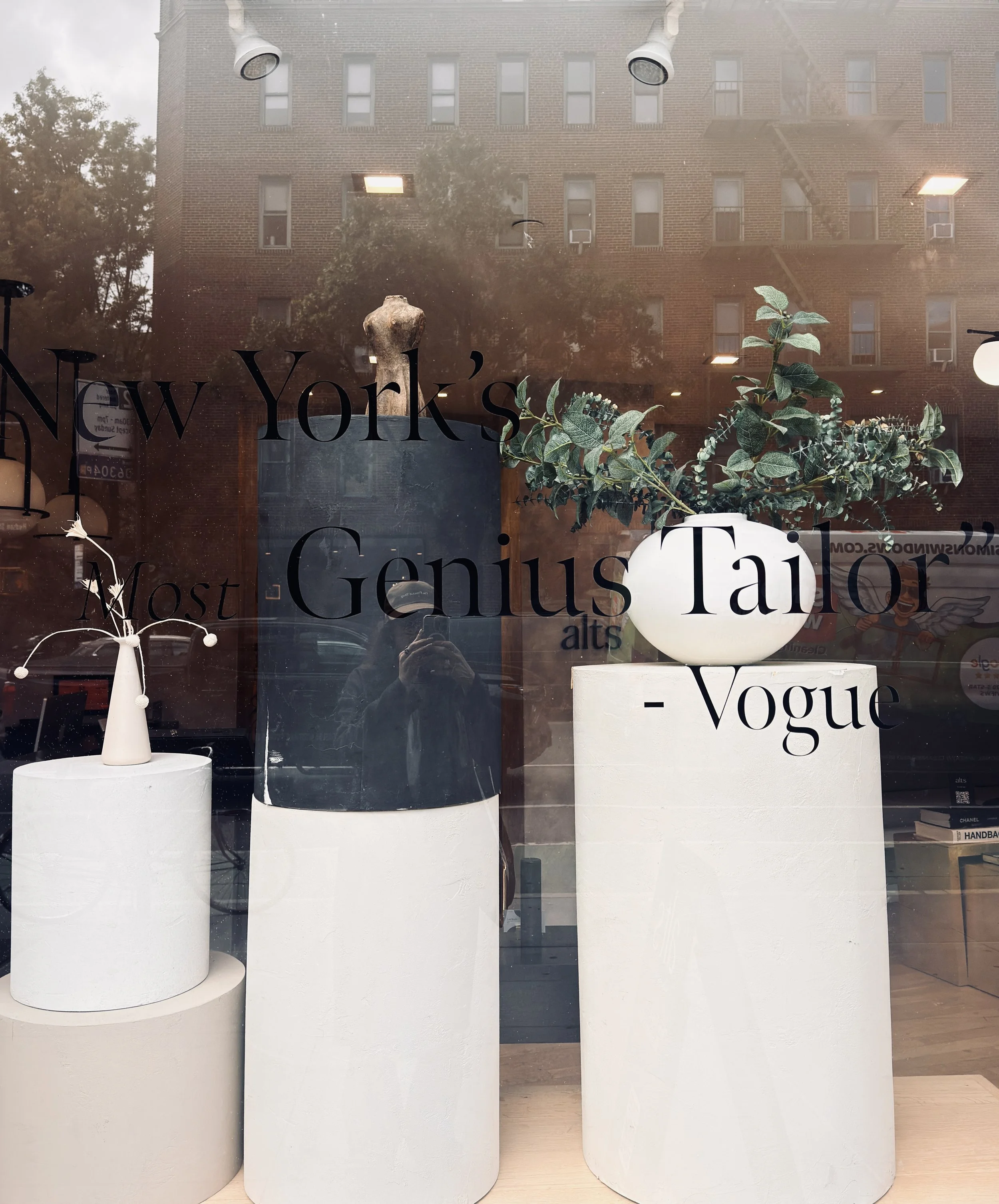
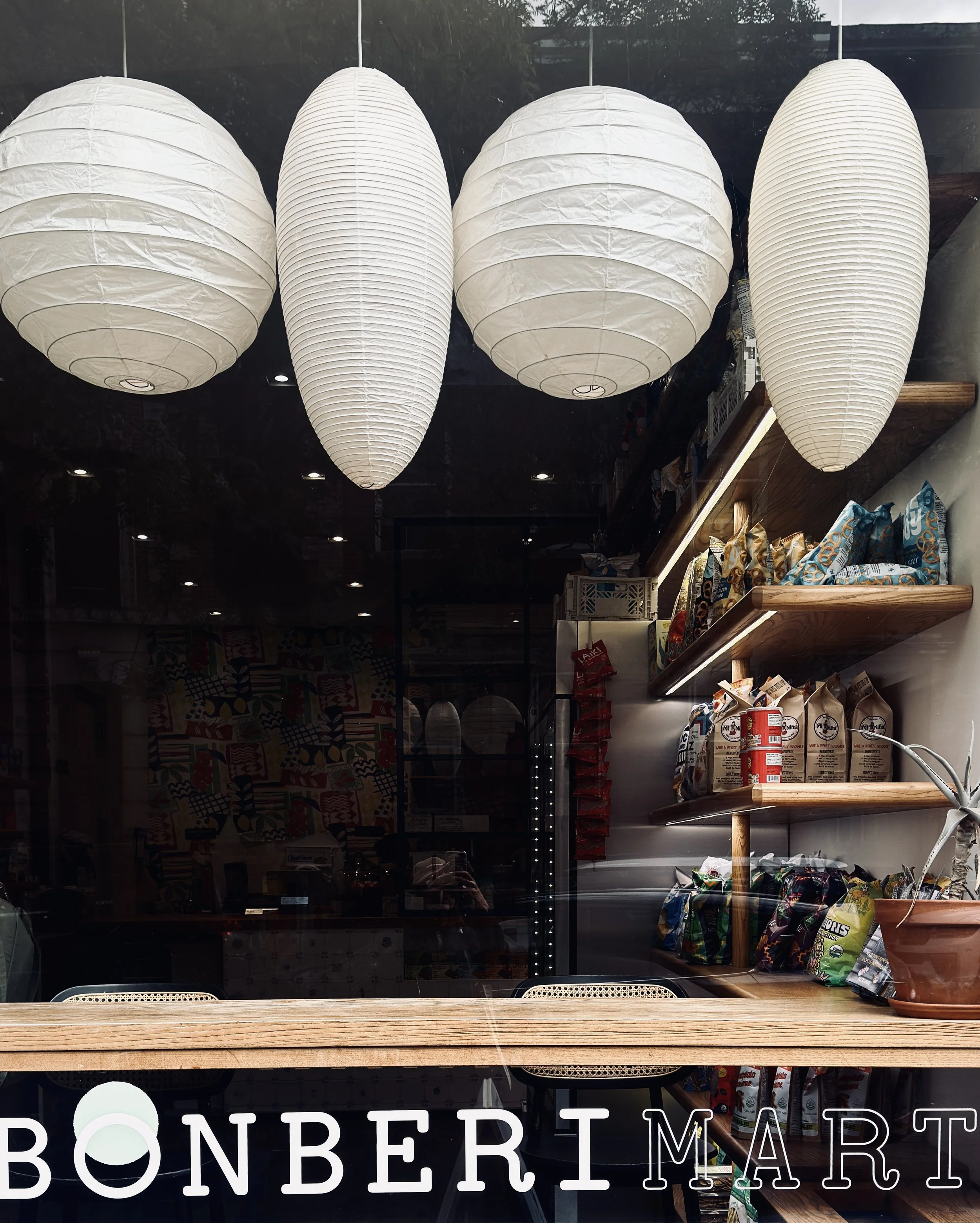
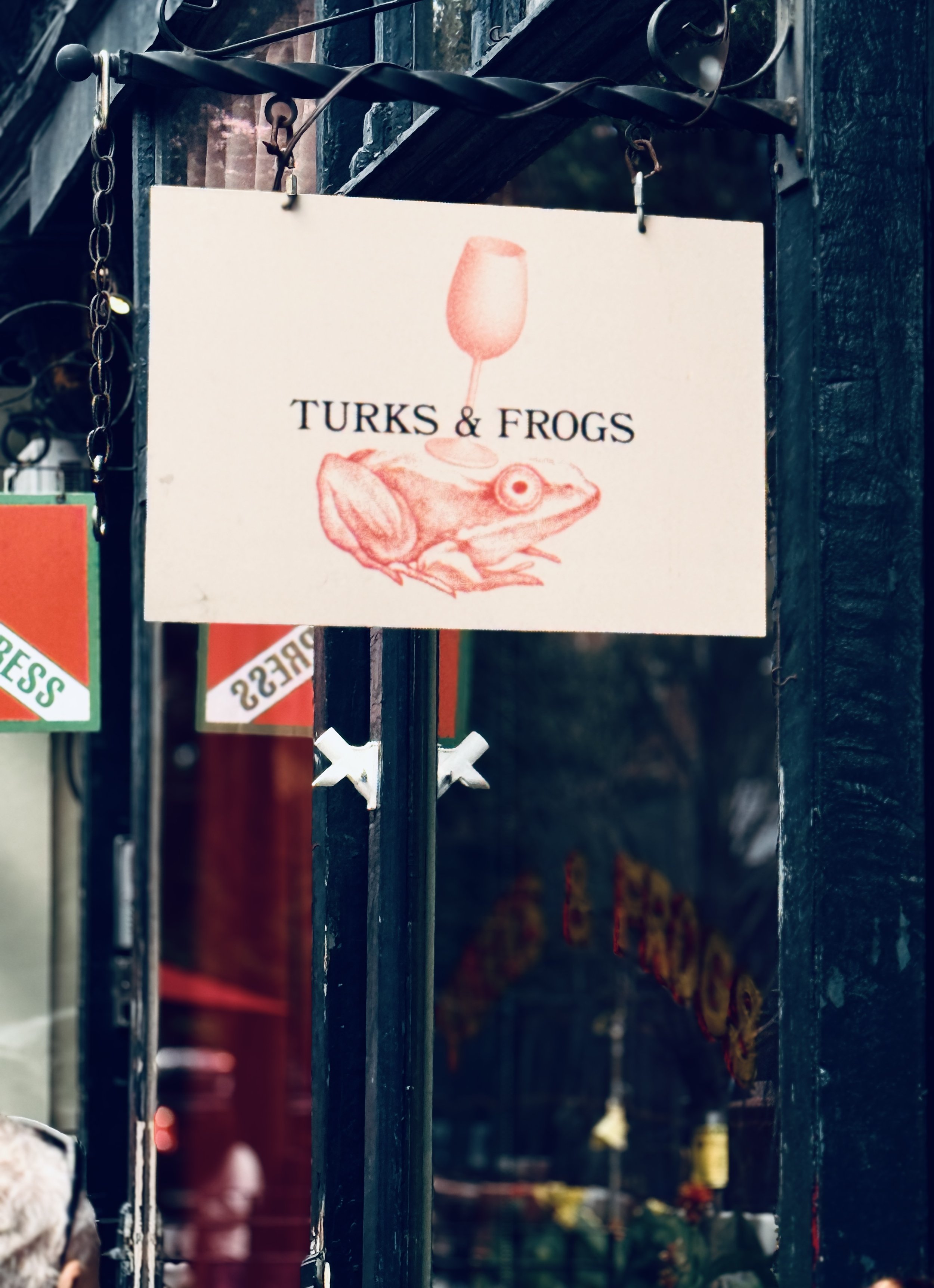
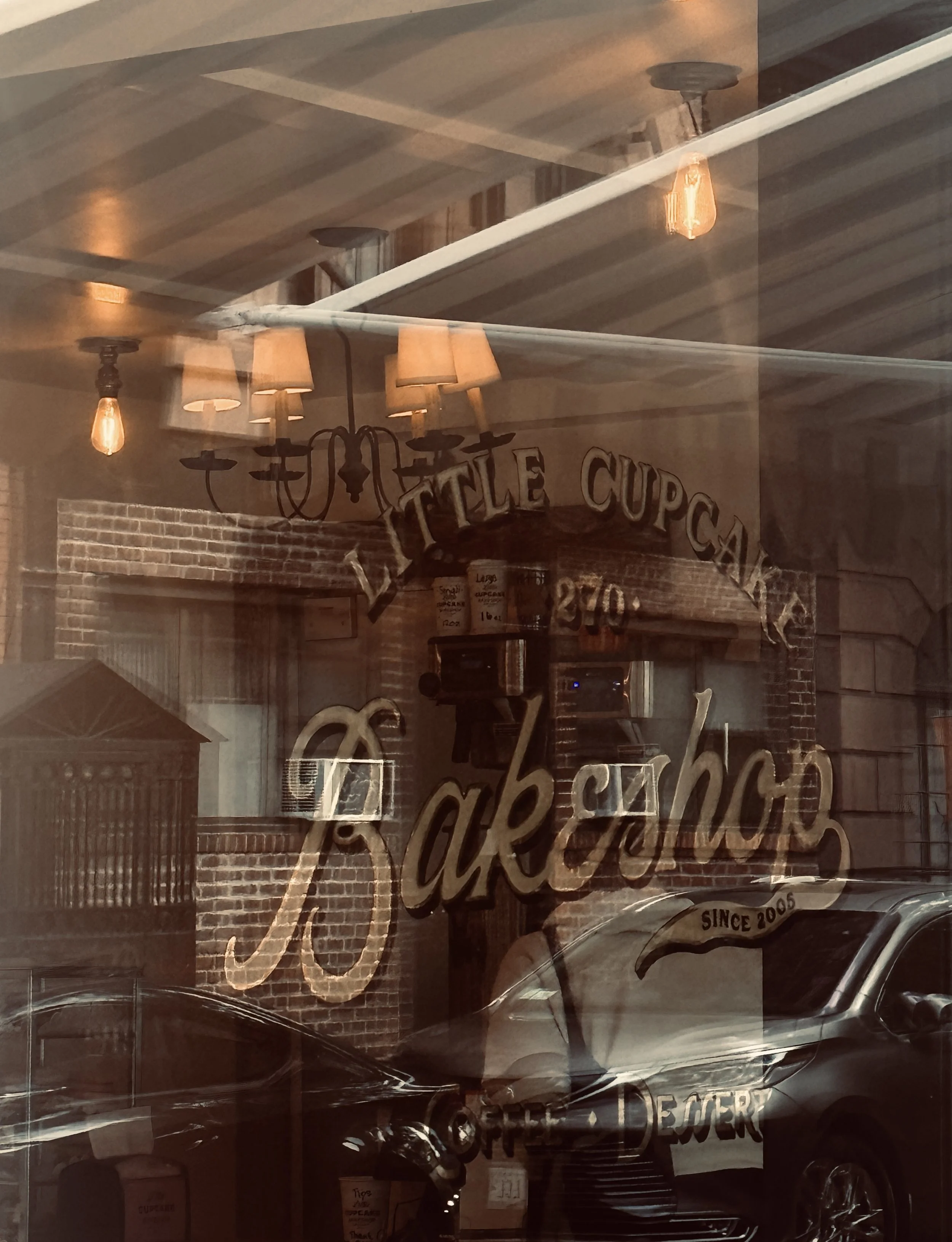
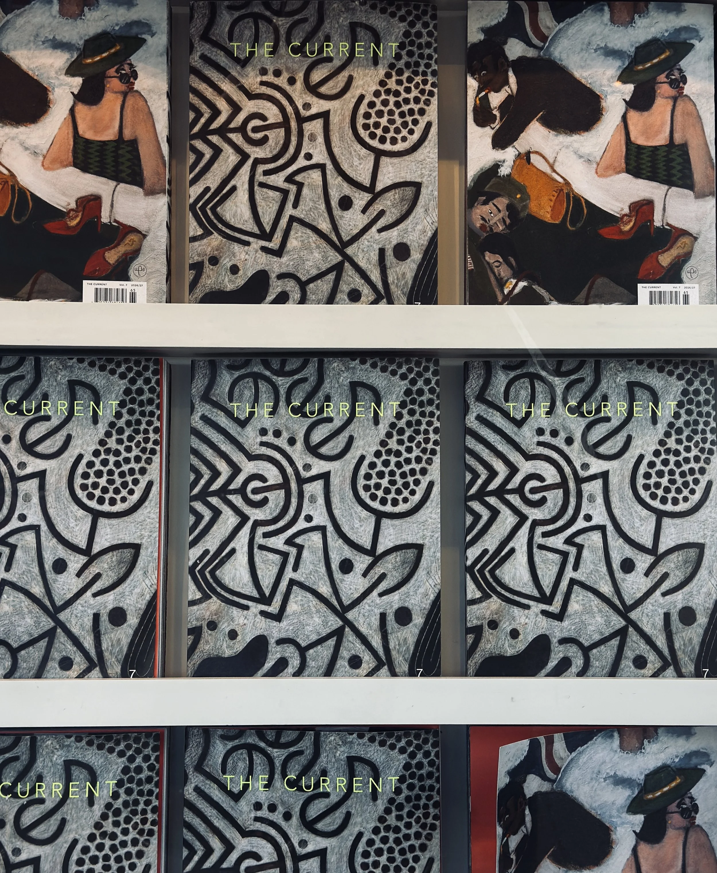
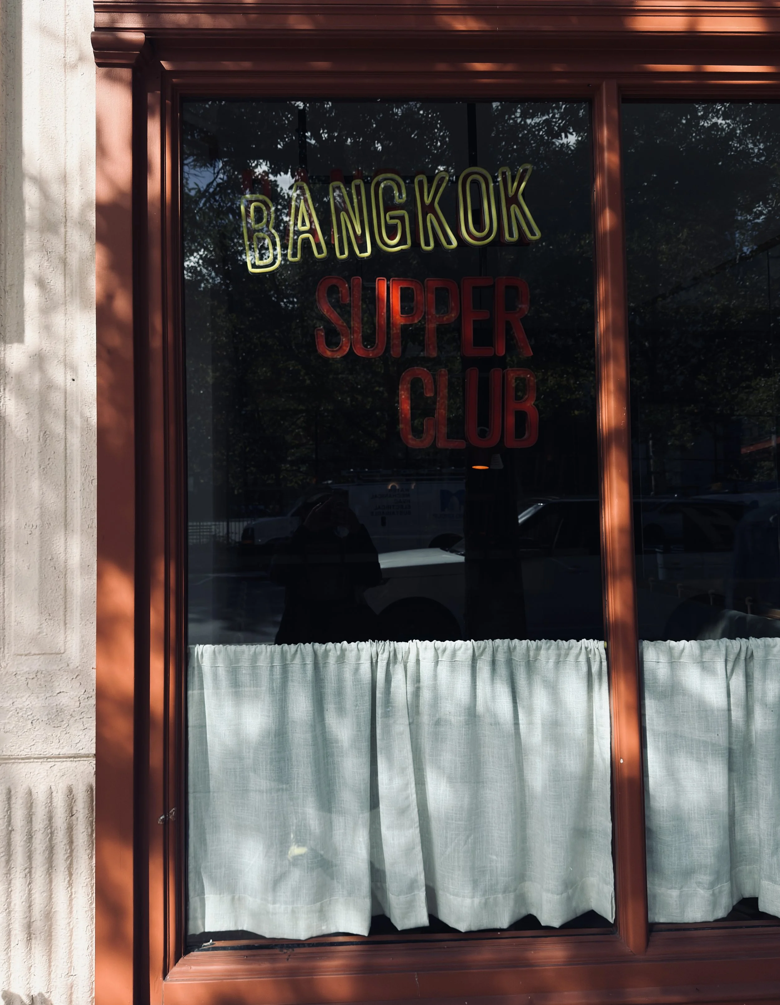
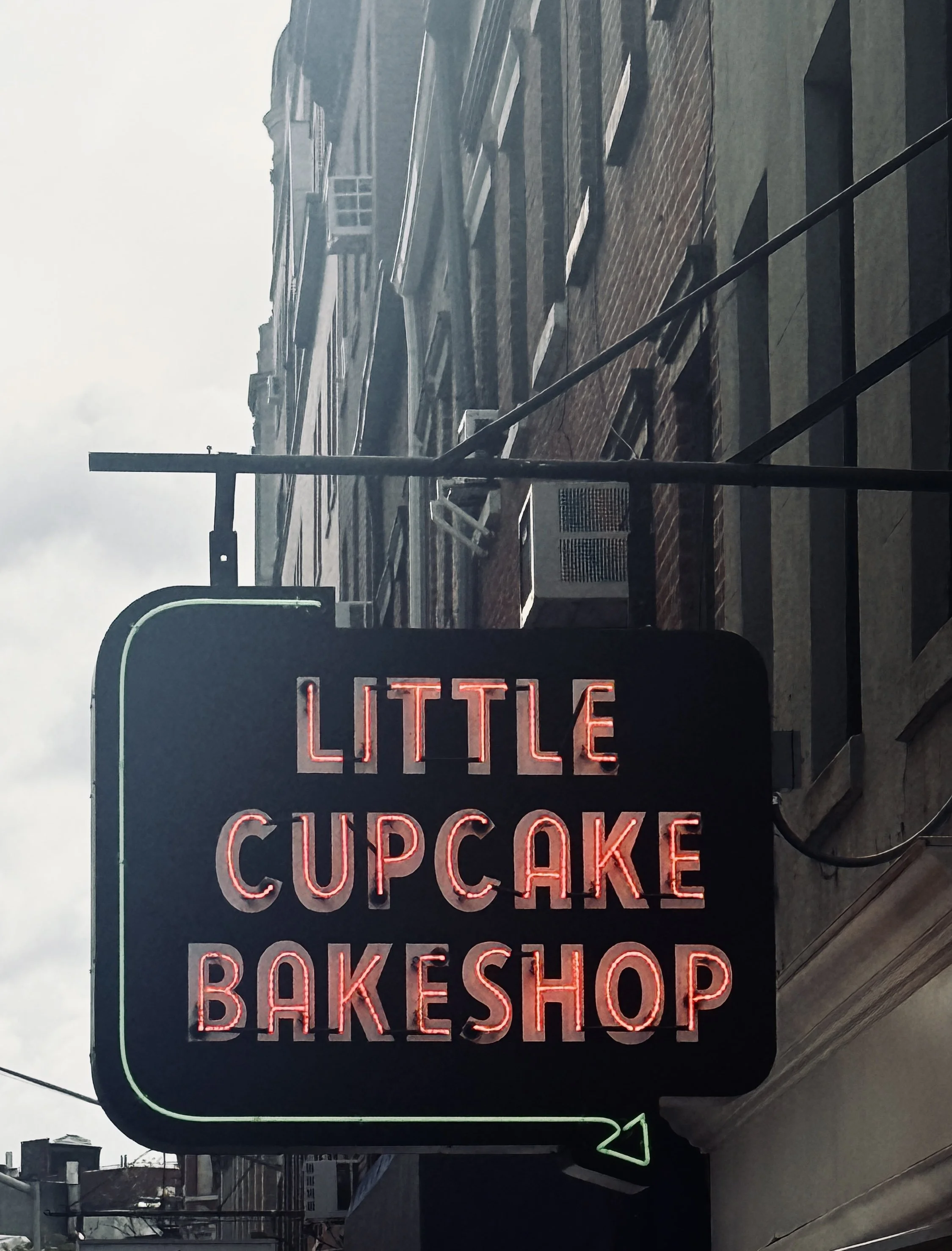
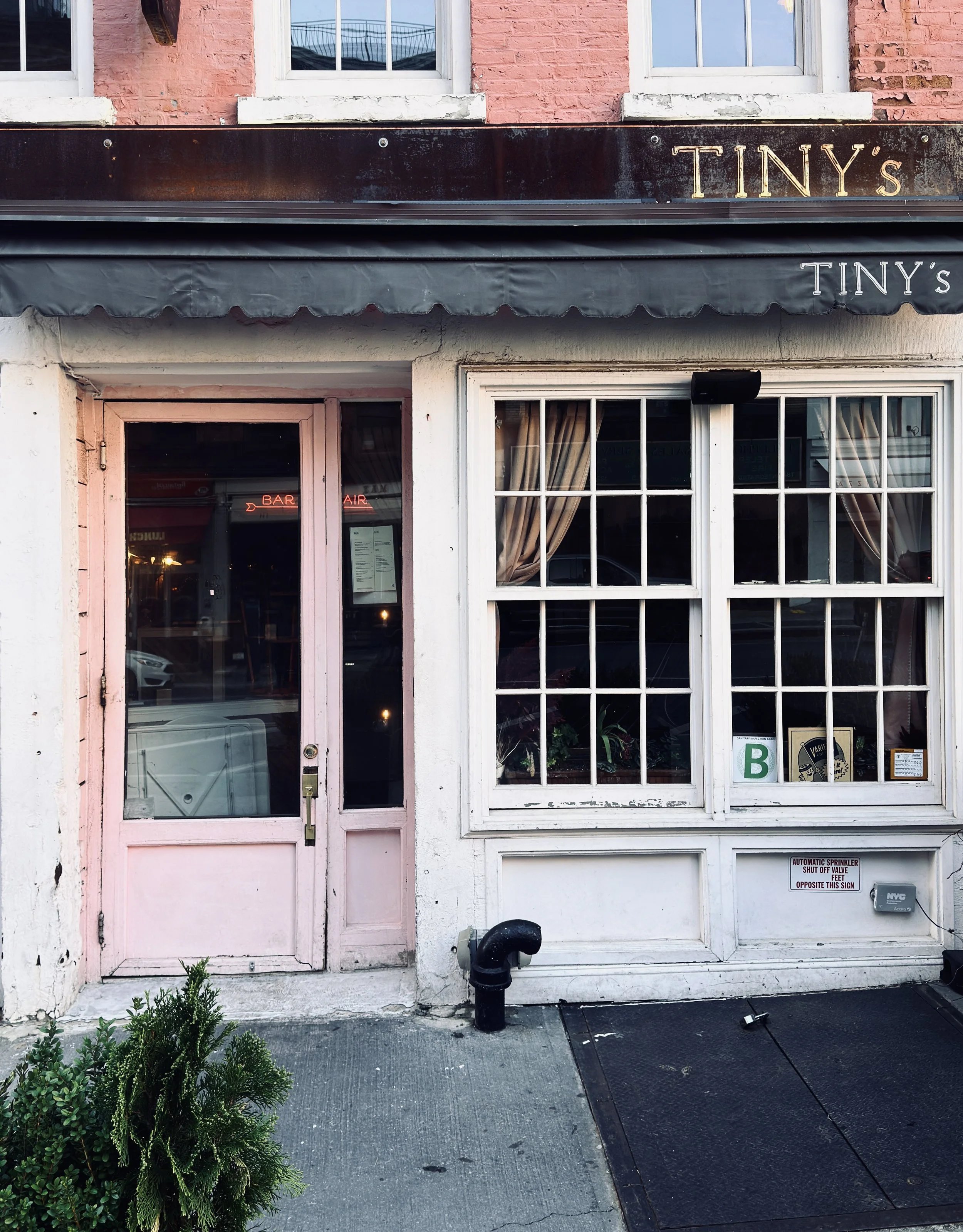
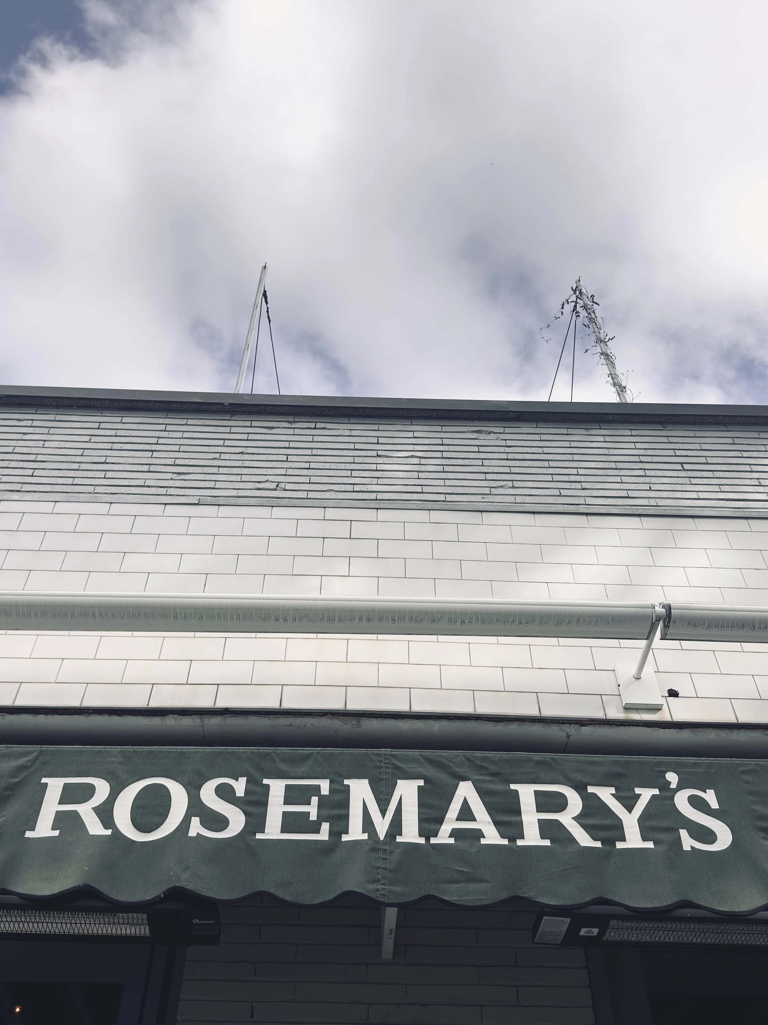
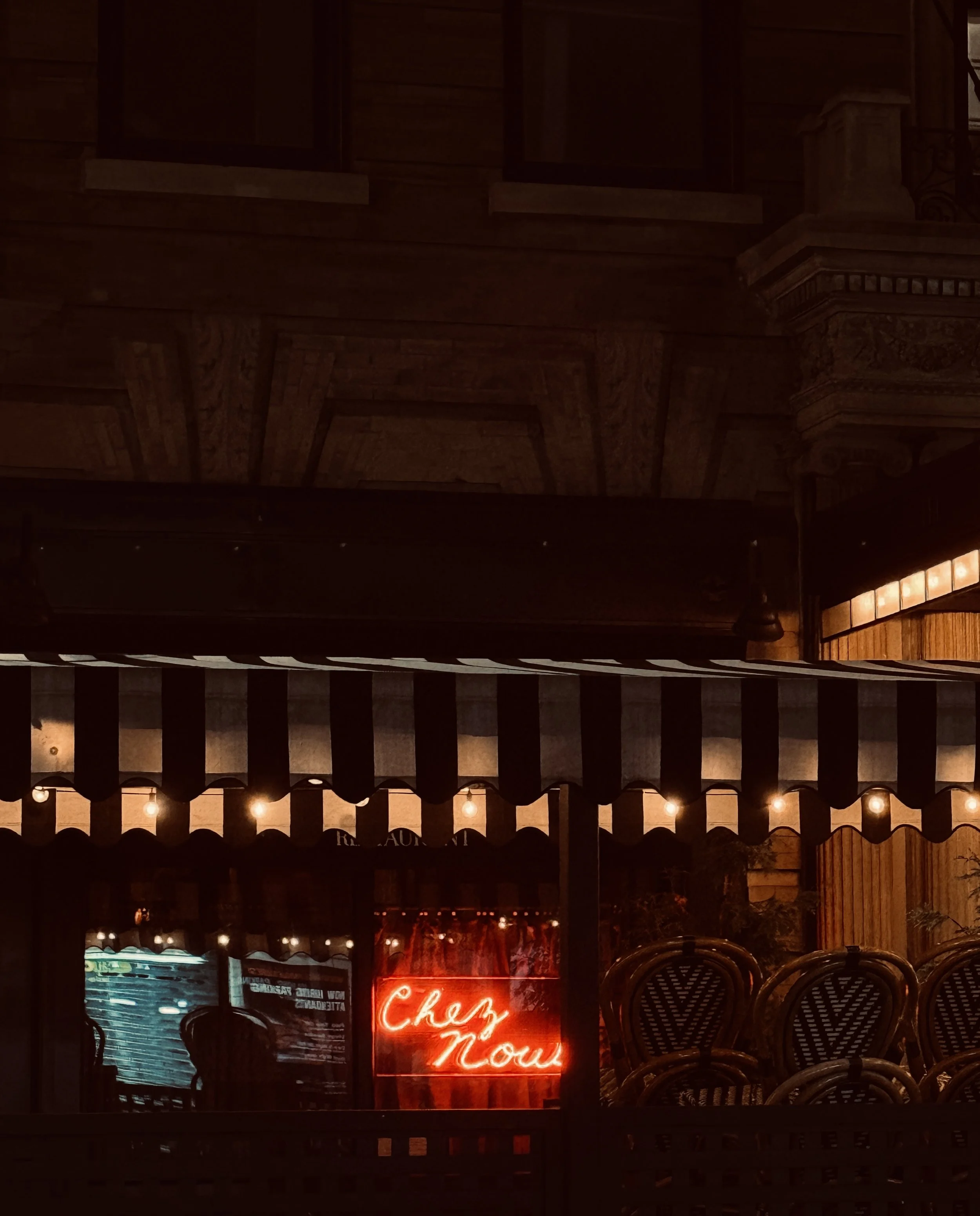
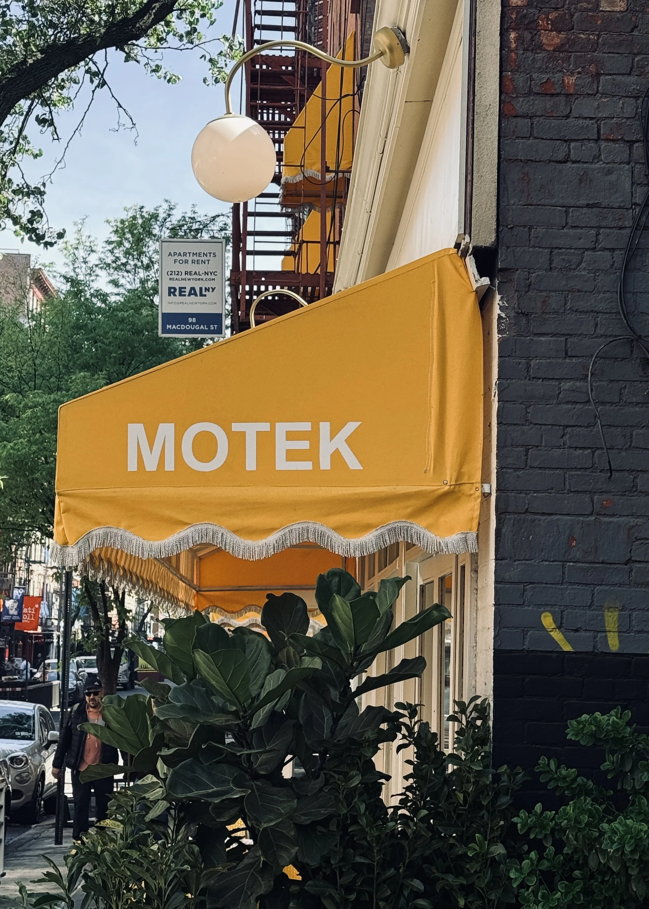
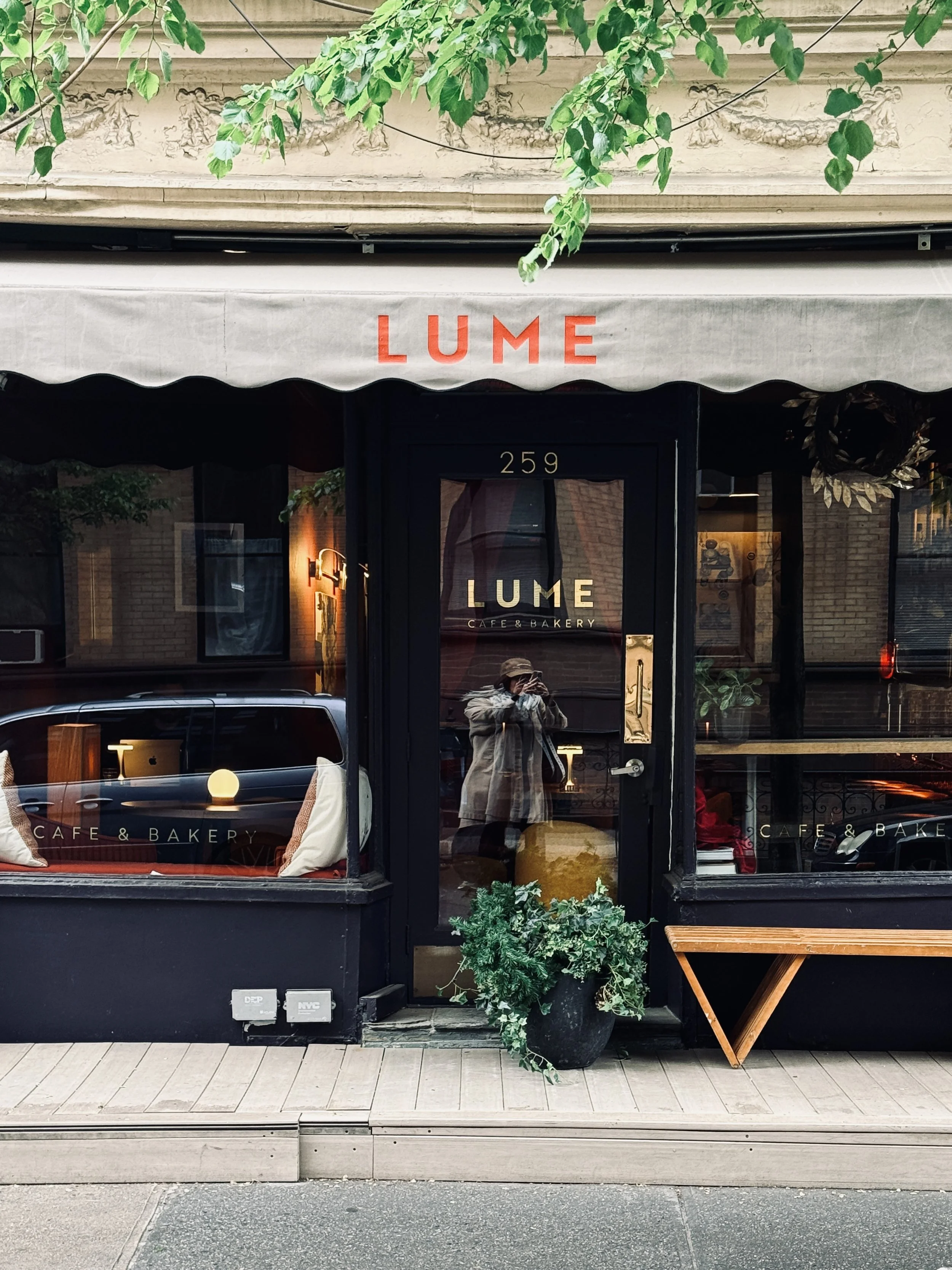
New York is one of them. As a brand designer, I find myself constantly drawn to its visual language — the typography, colours, signs, materials and little details that give a place its personality.
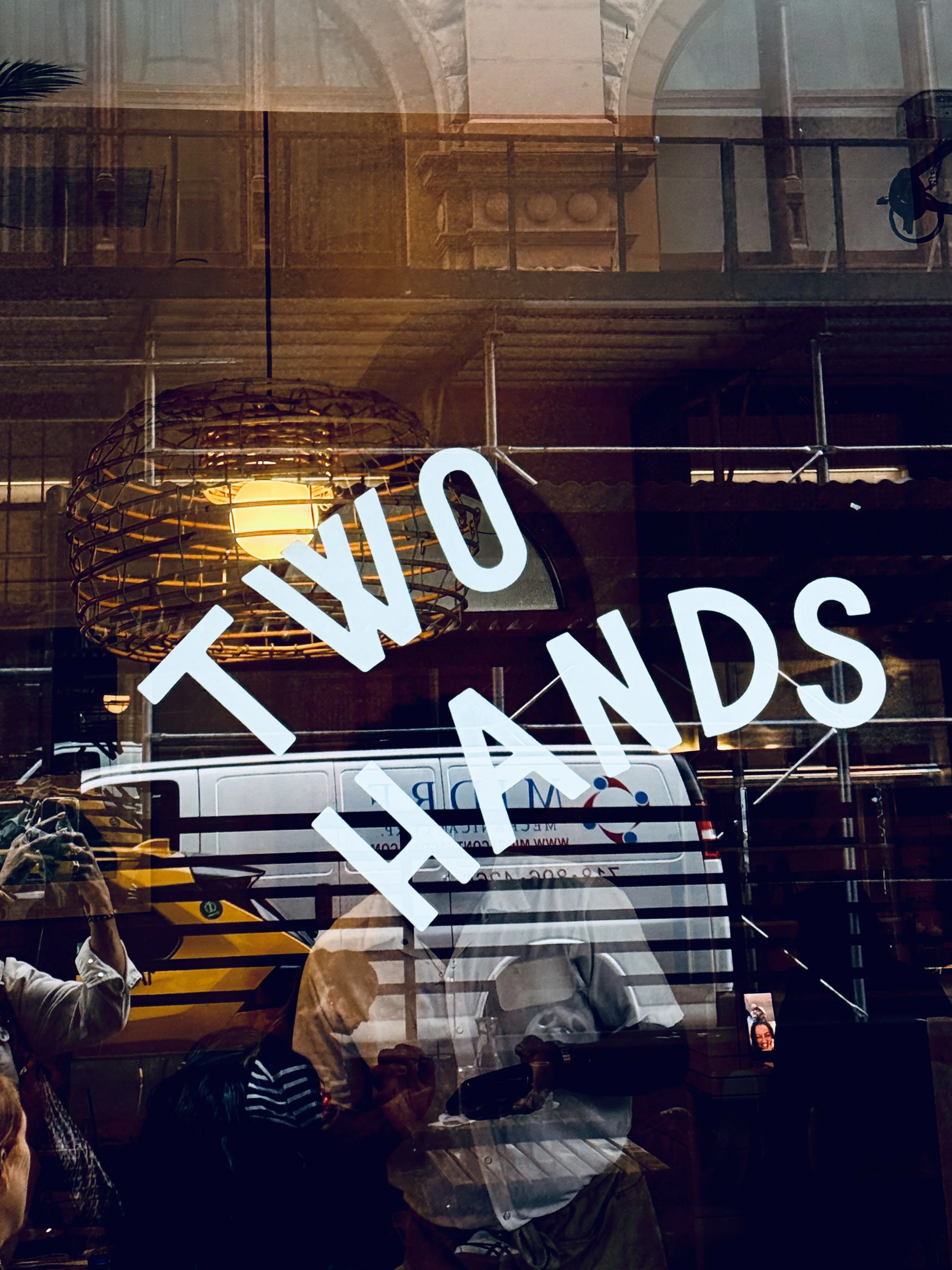
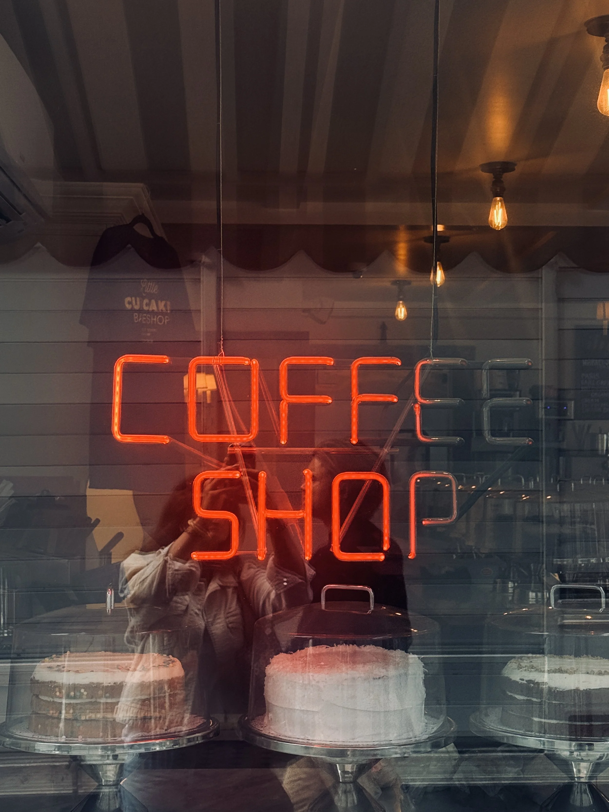
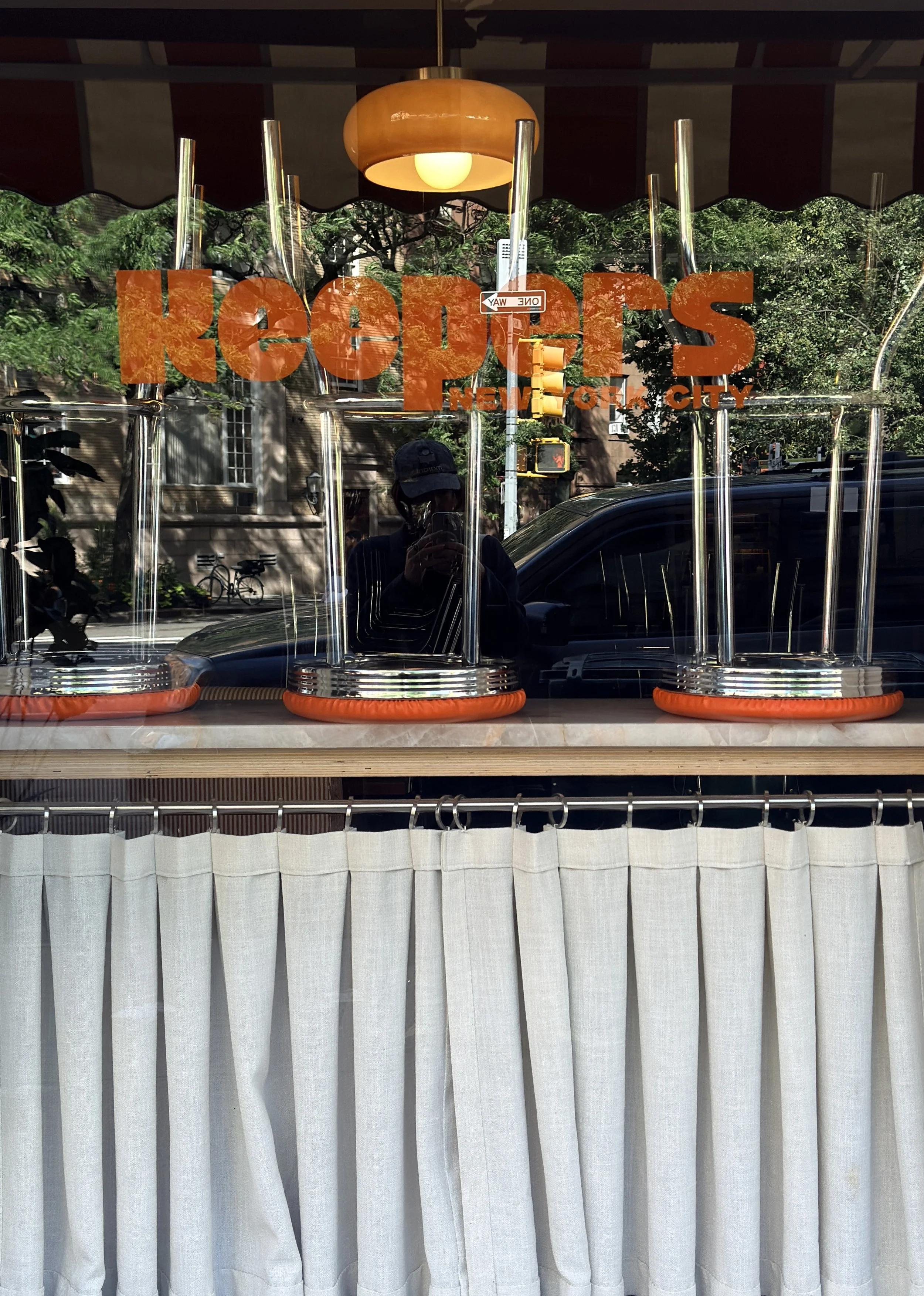
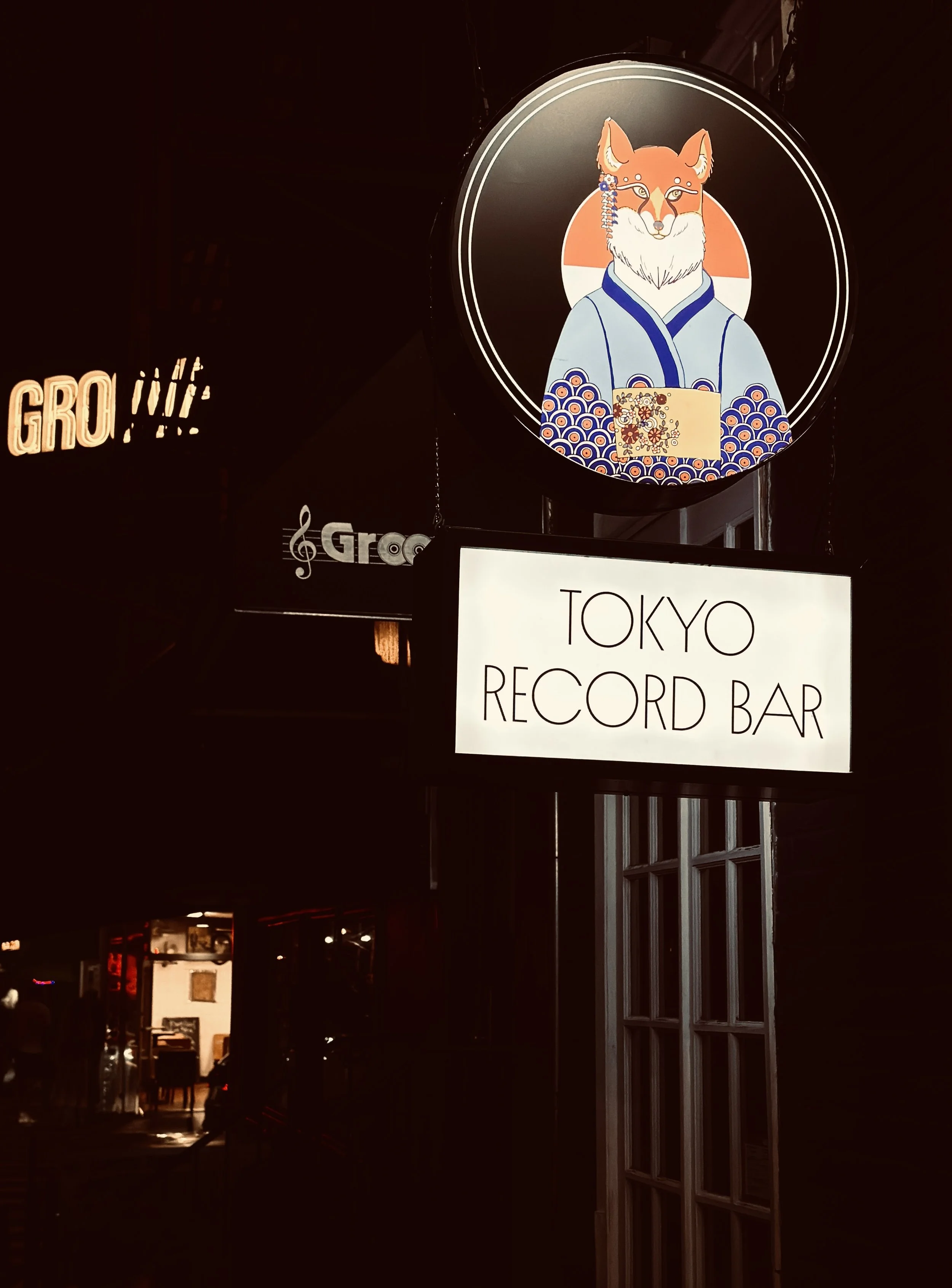
Every visit becomes a kind of visual treasure hunt, camera in hand, collecting the details that catch my eye and feed my creative work.
15 MIN READ
What makes you stop and
photograph a piece of branding?

My eye moves very quickly. I usually know almost instantly when something is going to catch my attention. It isn’t necessarily the visual identities I would choose for myself — there are so many different styles, and design is, of course, completely subjective. It’s more about something that makes me stop and look twice.
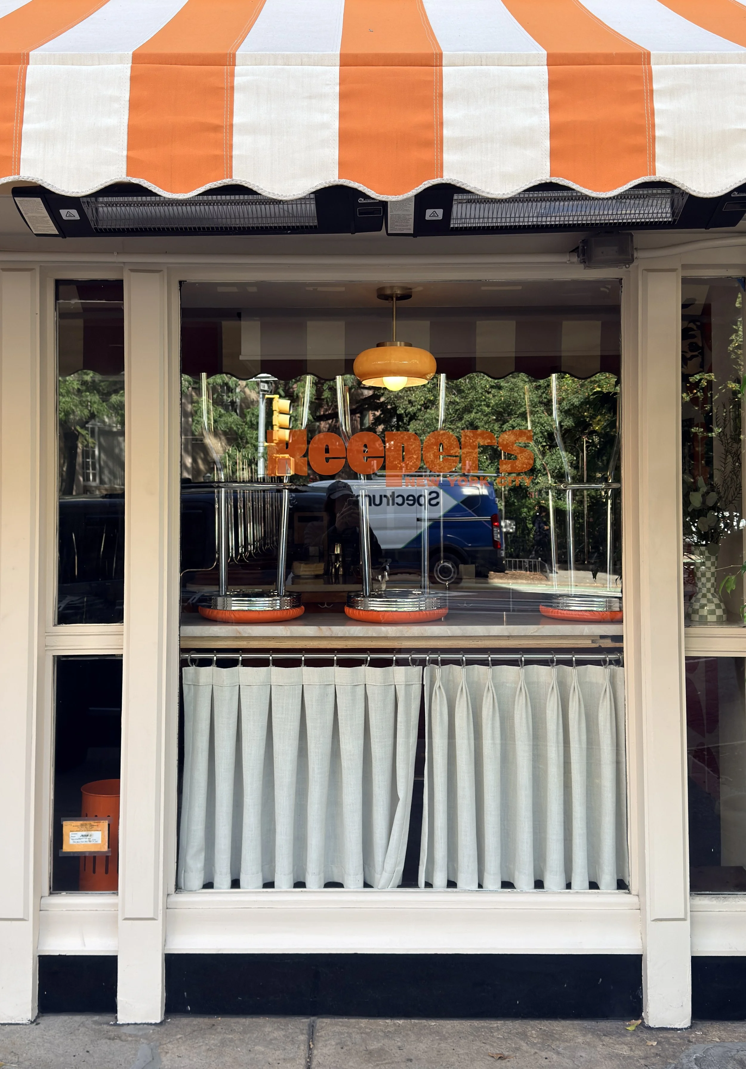
Sometimes it’s an unexpected colour palette, something very niche or unusual. Sometimes it’s a typeface or a piece of graphic design that feels completely out of the ordinary. Or it might simply be a very bold identity — something highly visual, colourful or striking enough to stop you in your tracks.
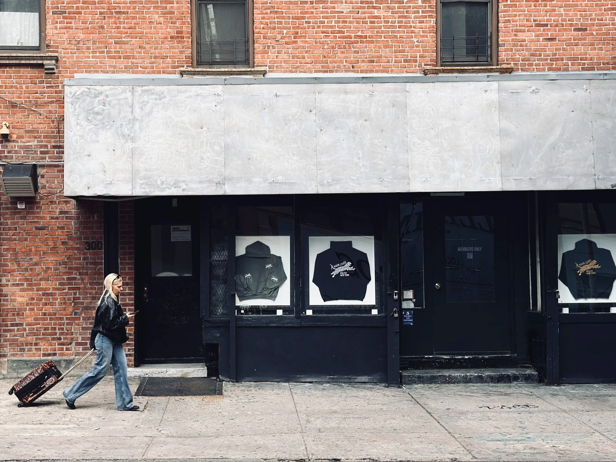
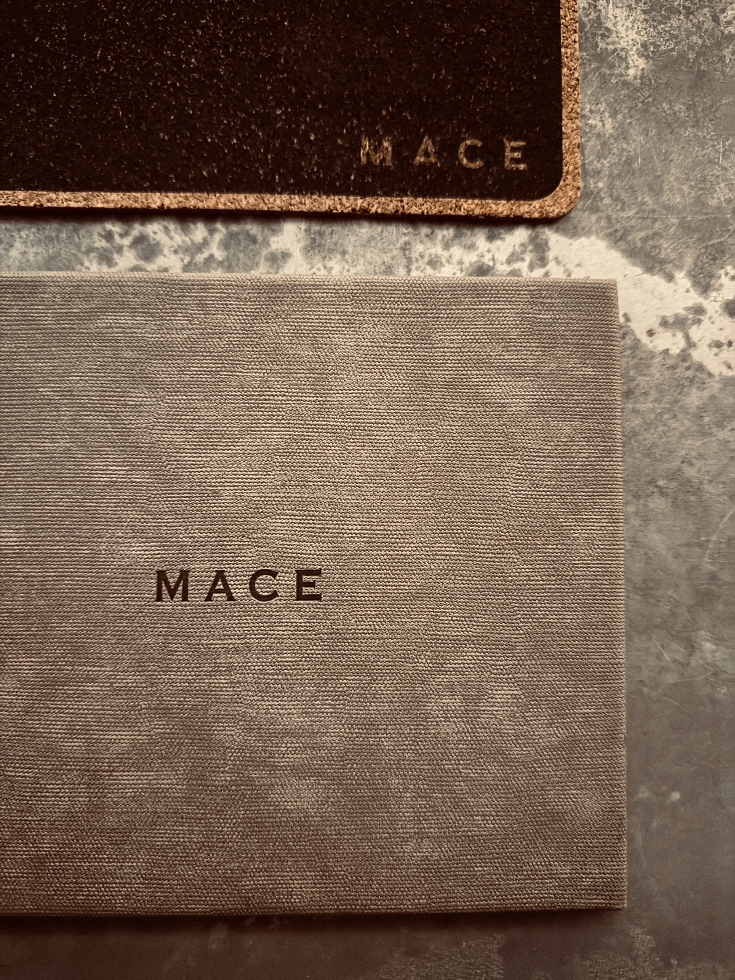
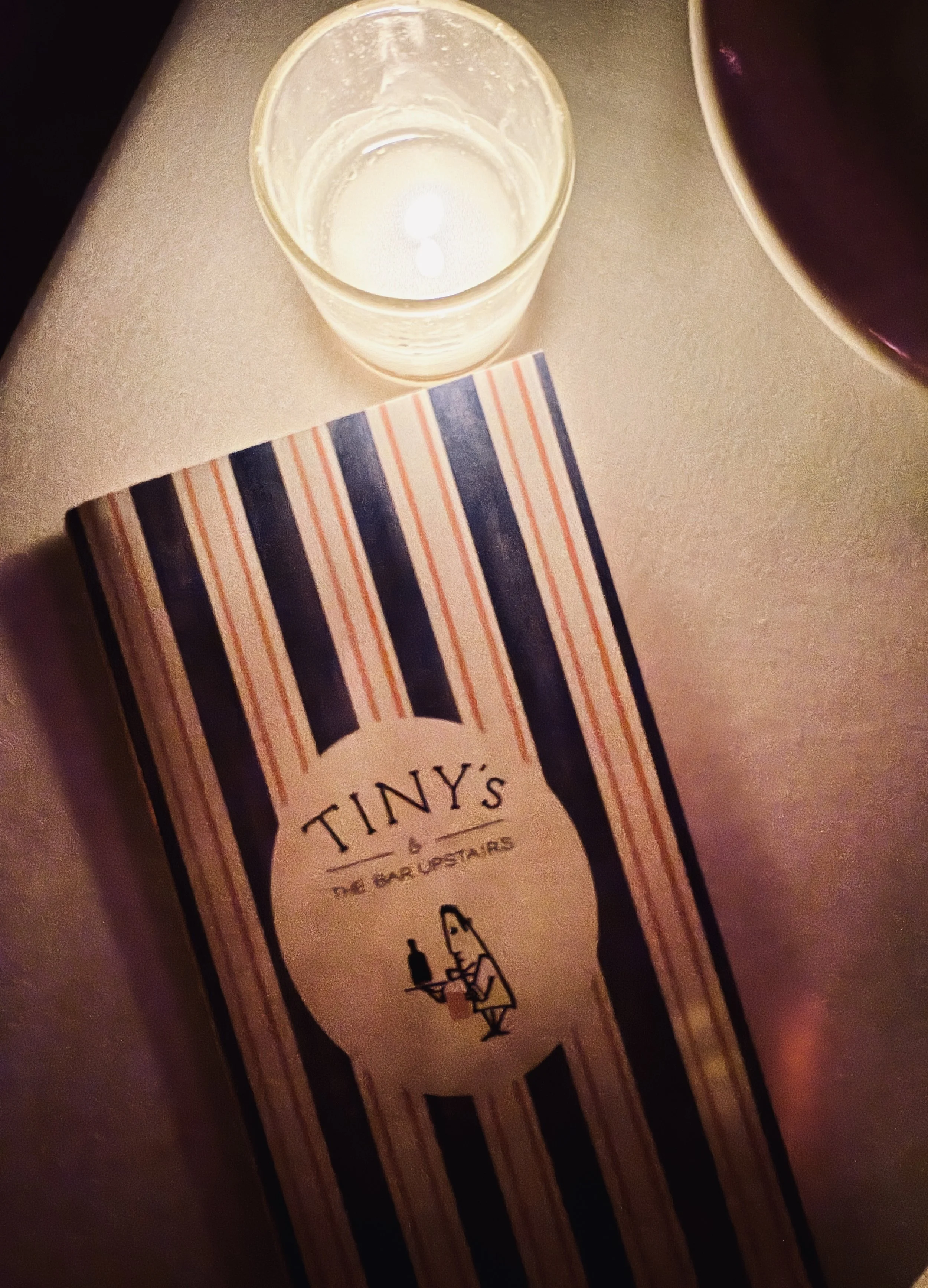
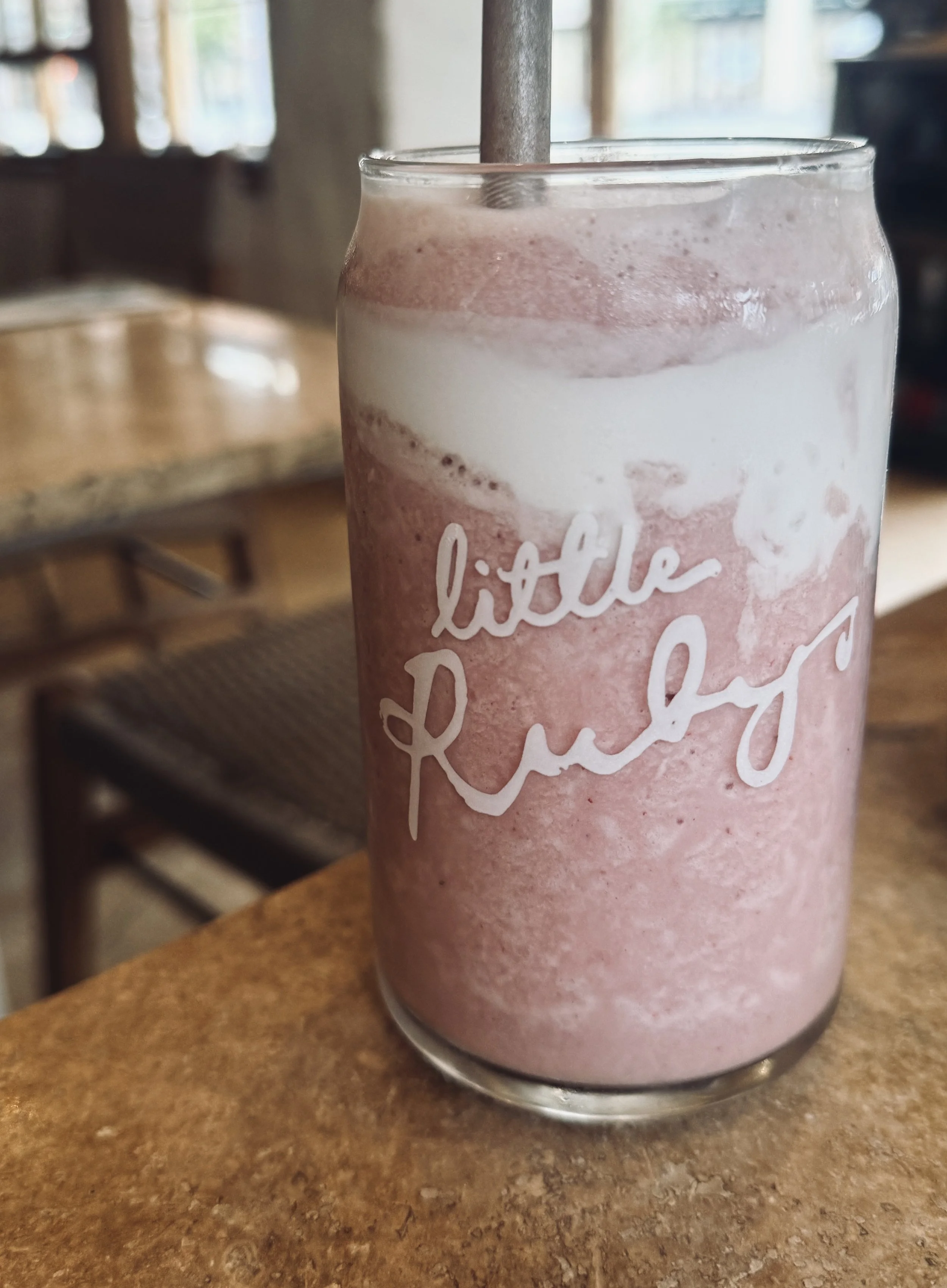
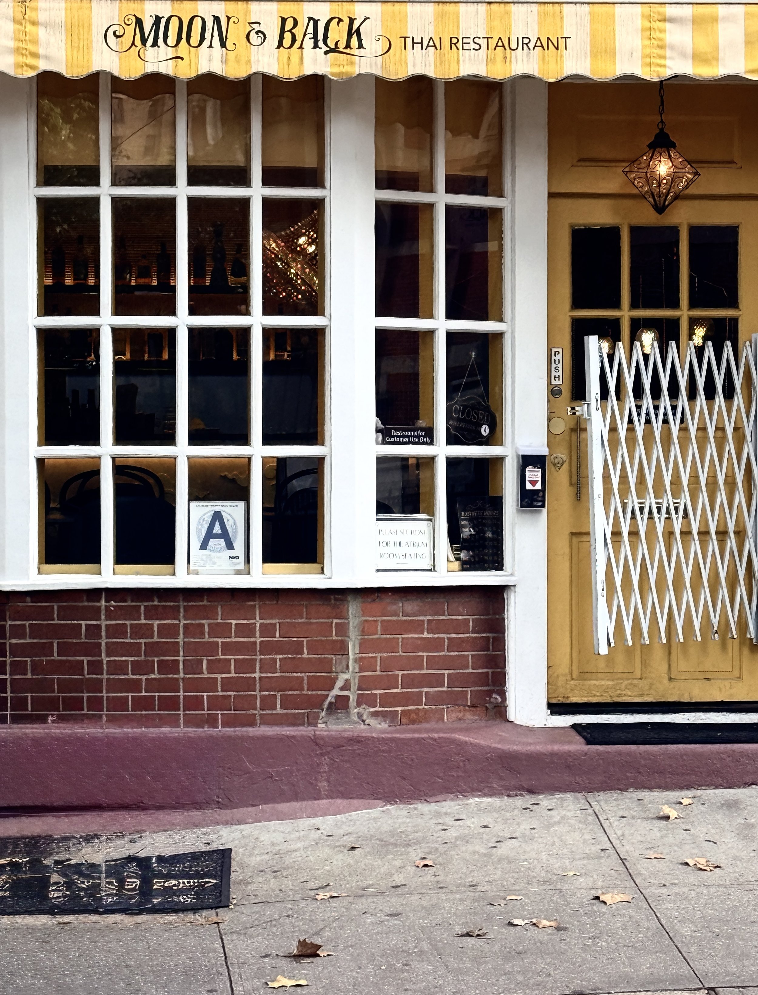
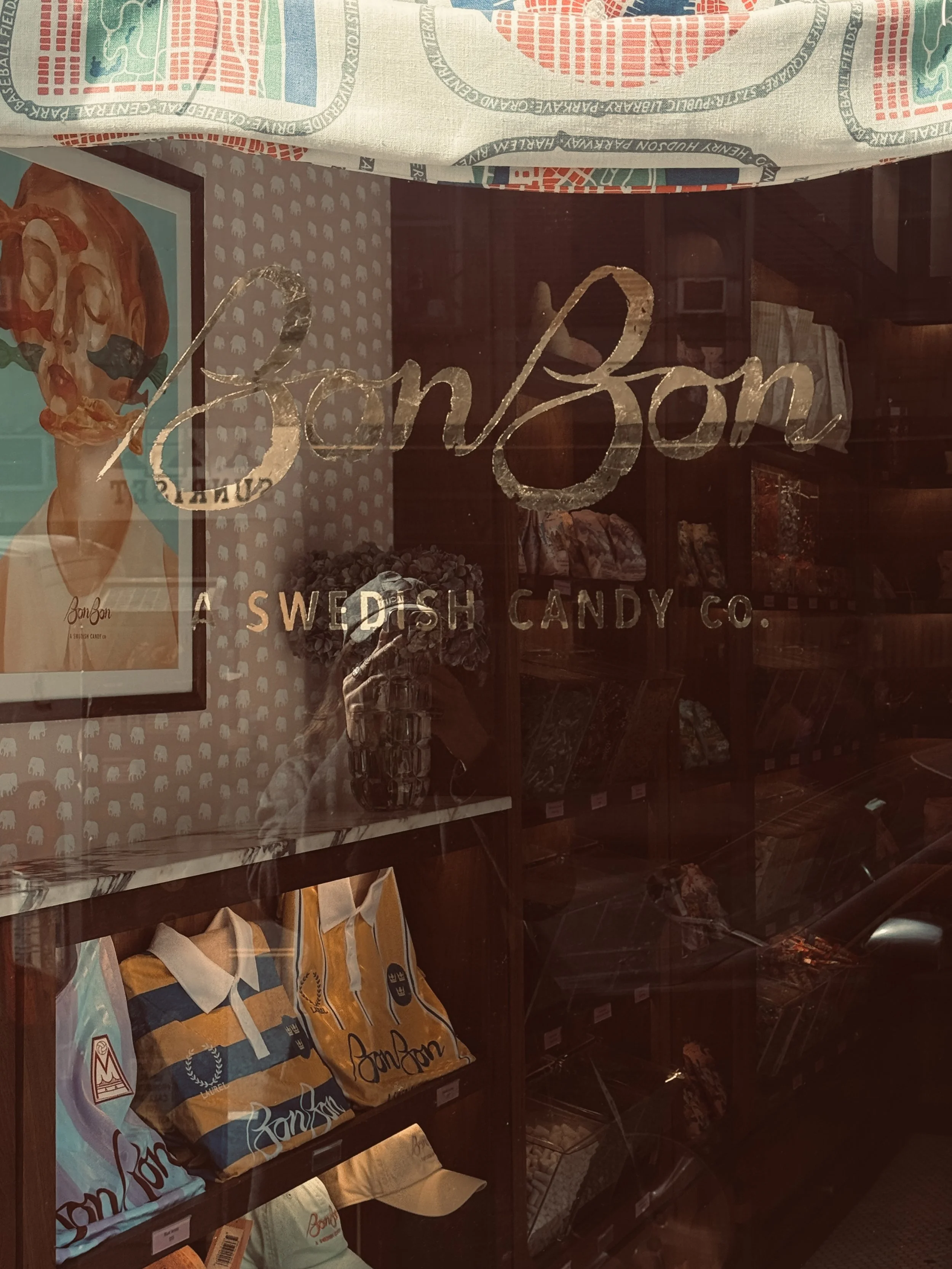
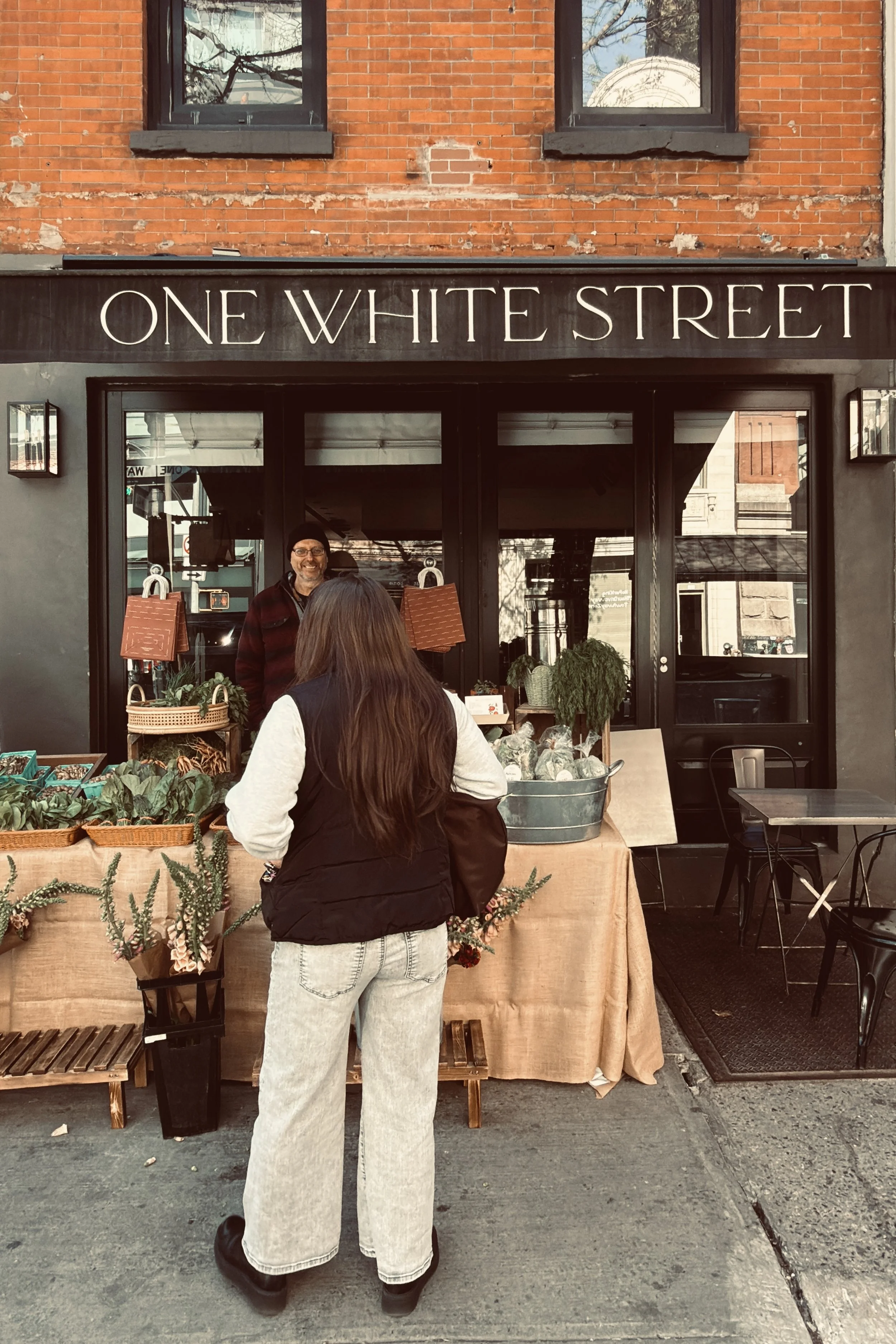
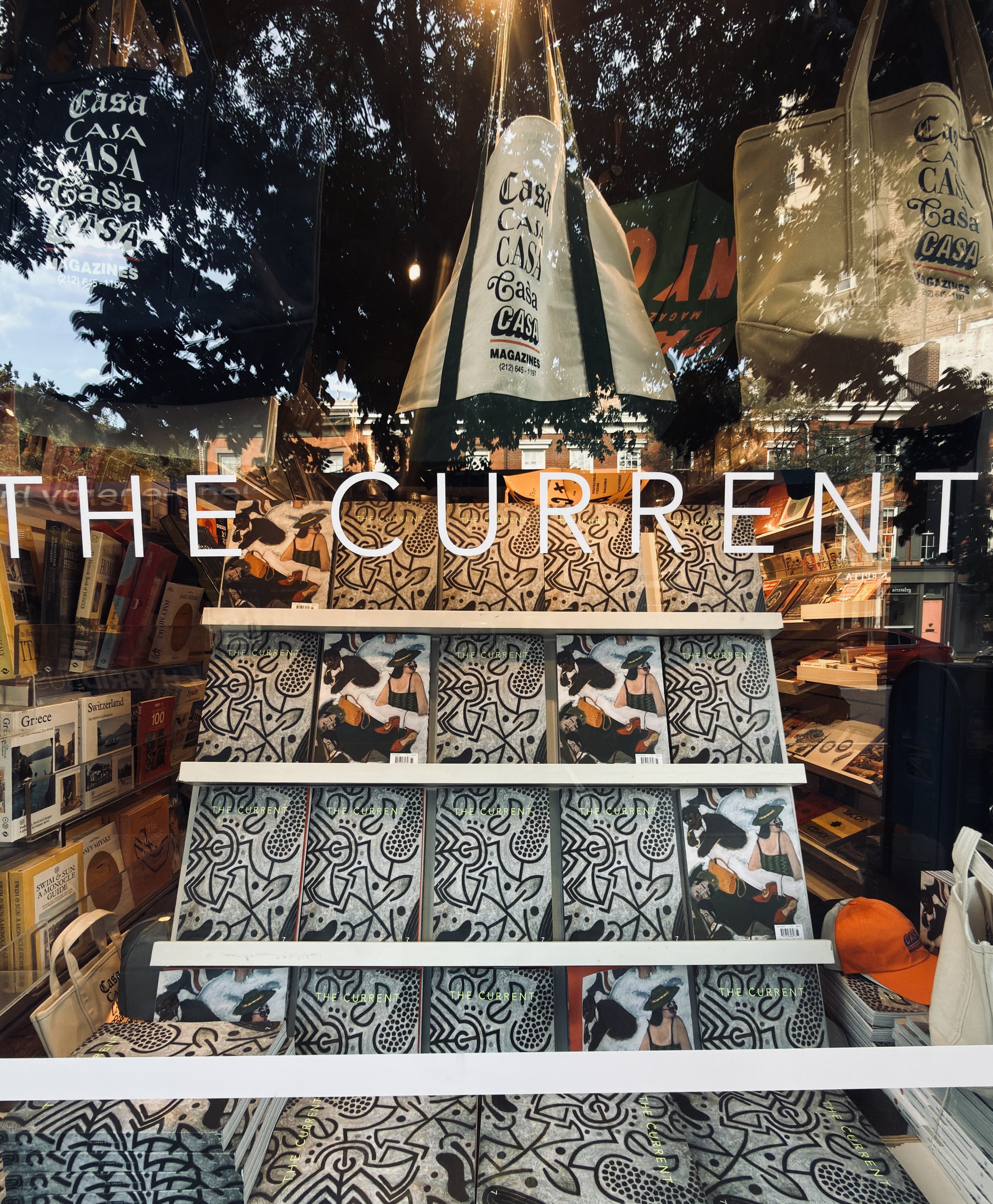
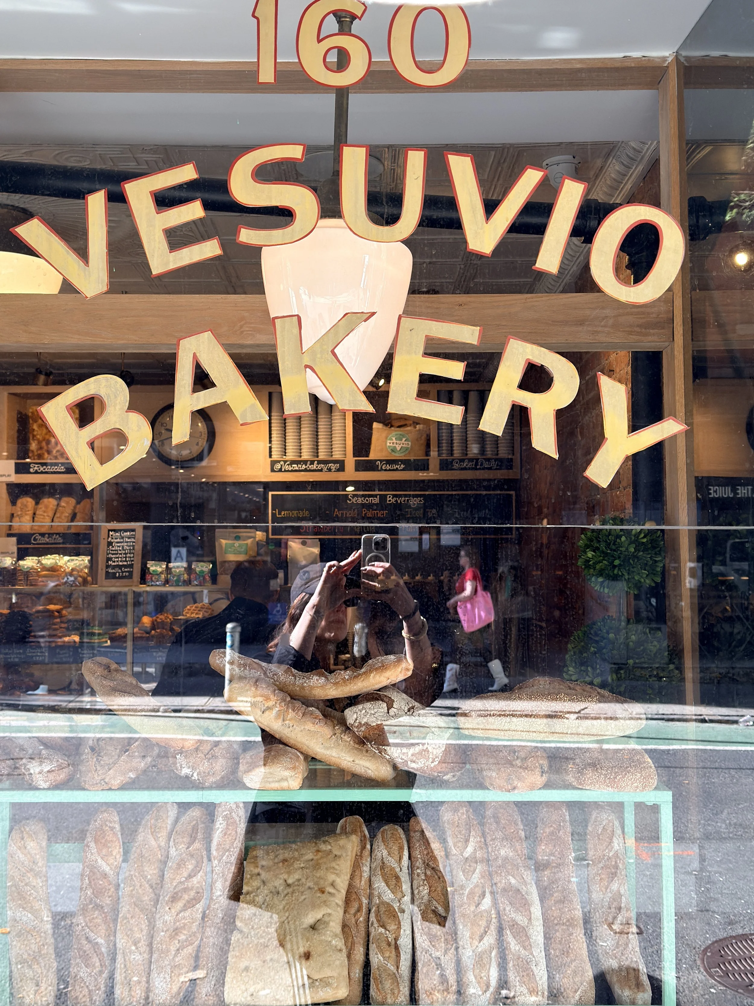
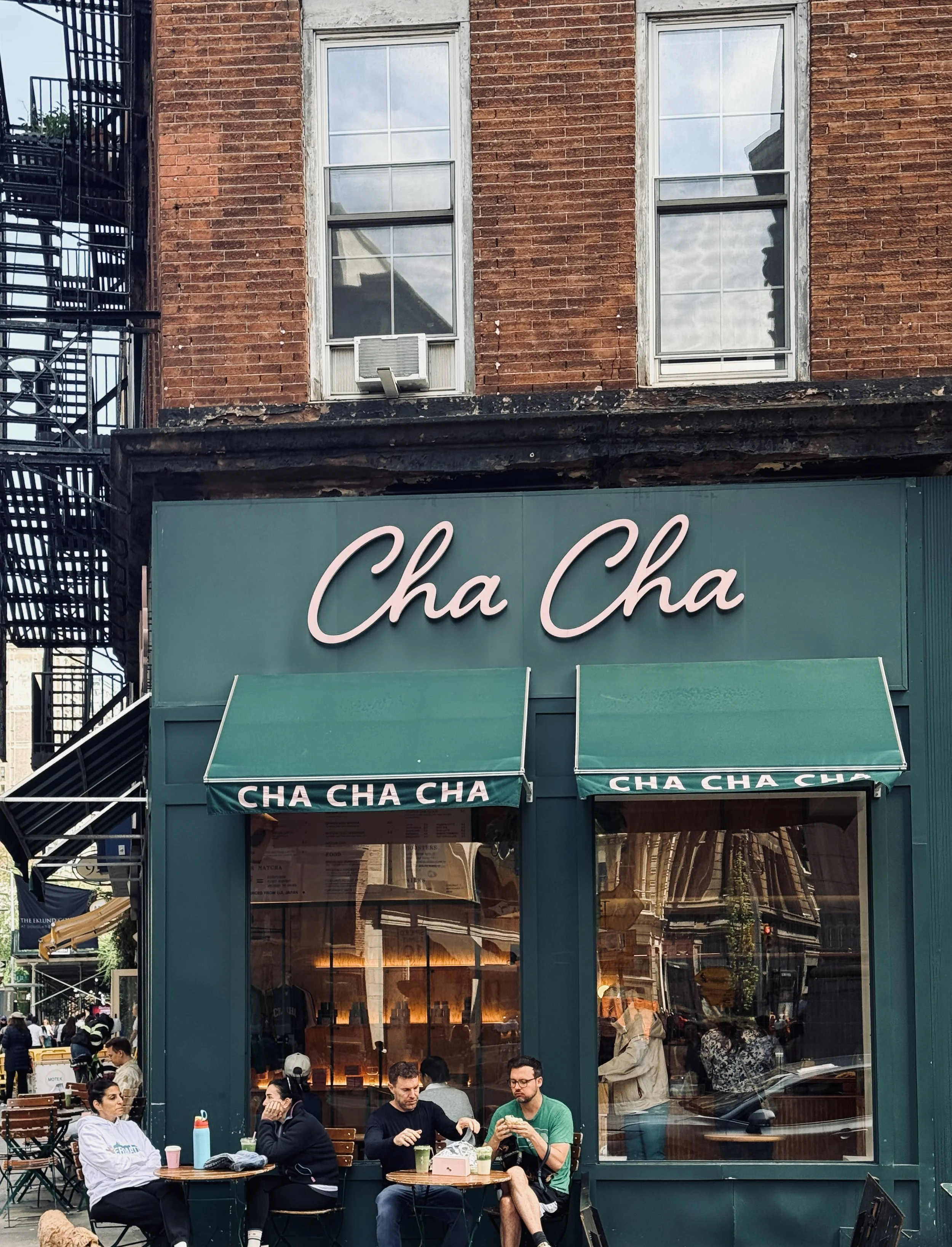
I’m also really interested in what happens when a visual identity is taken beyond the obvious. A restaurant menu, for example, might use the same language on its coasters, packaging or matchboxes. In New York, I’ve noticed so many cafés, bars and even small bakeries extending their identities into merchandise — T-shirts, sweatshirts, caps and other pieces that people can actually take home with them.
That’s when branding becomes particularly interesting to me: when an identity doesn’t just sit on a logo, but becomes part of the whole experience.
Do you think you see cities differently
because you are a brand designer?
I definitely think I do. When I travel, I’m always looking for things to discover, and food is a huge part of that for me. I’m a real food lover, and I find the possibilities of flavour almost infinite. But there’s a visual dimension to food too — the way a dish is presented, the creativity of a plate, even the tableware. I notice those details, and they matter to me.
Of course, I want to discover the local specialities and understand something of the culture through what people eat. I’ll also seek out the places you’re expected to see in a destination — the architecture, the history, the heritage. But what fascinates me most is often what happens in between those obvious landmarks.
I’m drawn to street scenes, local clothing and costumes, unusual moments, artists, people going about their everyday lives. I’m always looking for images that feel less traditional and more unexpected — something that captures a sense of place without necessarily being the postcard version of it.
And then there is the visual identity of the city itself, surrounding you on every side.
“It’s almost like opening a giant graphic design
book and walking through its pages.”
You move from one logo to another, one typeface to another, one colour combination to another. There is always something new to notice. So yes, I think being a brand designer changes the way I experience a city, because I’m constantly looking — and the inspiration is essentially endless.
“FOR A BRAND DESIGNER, NYC IS LESS A CITY
TO VISIT THAN A CITY TO OBSERVE”
What can a great brand identity
reveal about the business behind it?
A well-considered visual identity can communicate an enormous amount about a business before you’ve even interacted with it. It can give you a sense of its positioning, its personality, its level of quality and, importantly, the kind of customer it wants to attract.
There is usually a lot of thought behind a strong brand identity. The typography, colours, imagery, graphic language and tone all need to work together to communicate a particular message and create the right feeling. And, above all, it needs to make sense for the business itself. The identity has to feel coherent with what the brand actually offers.
The same is true of the audience. You’re not designing for everyone. You’re creating something that should resonate with the people you want to reach — people who might recognise something of themselves in the personality and values of the brand.
“Good brand design creates that sense of recognition.”
When the strategy and the visual identity are working together, the right people should almost feel that the brand was made with them in mind.
Do you notice the branding of a place before
you notice what it actually sells?
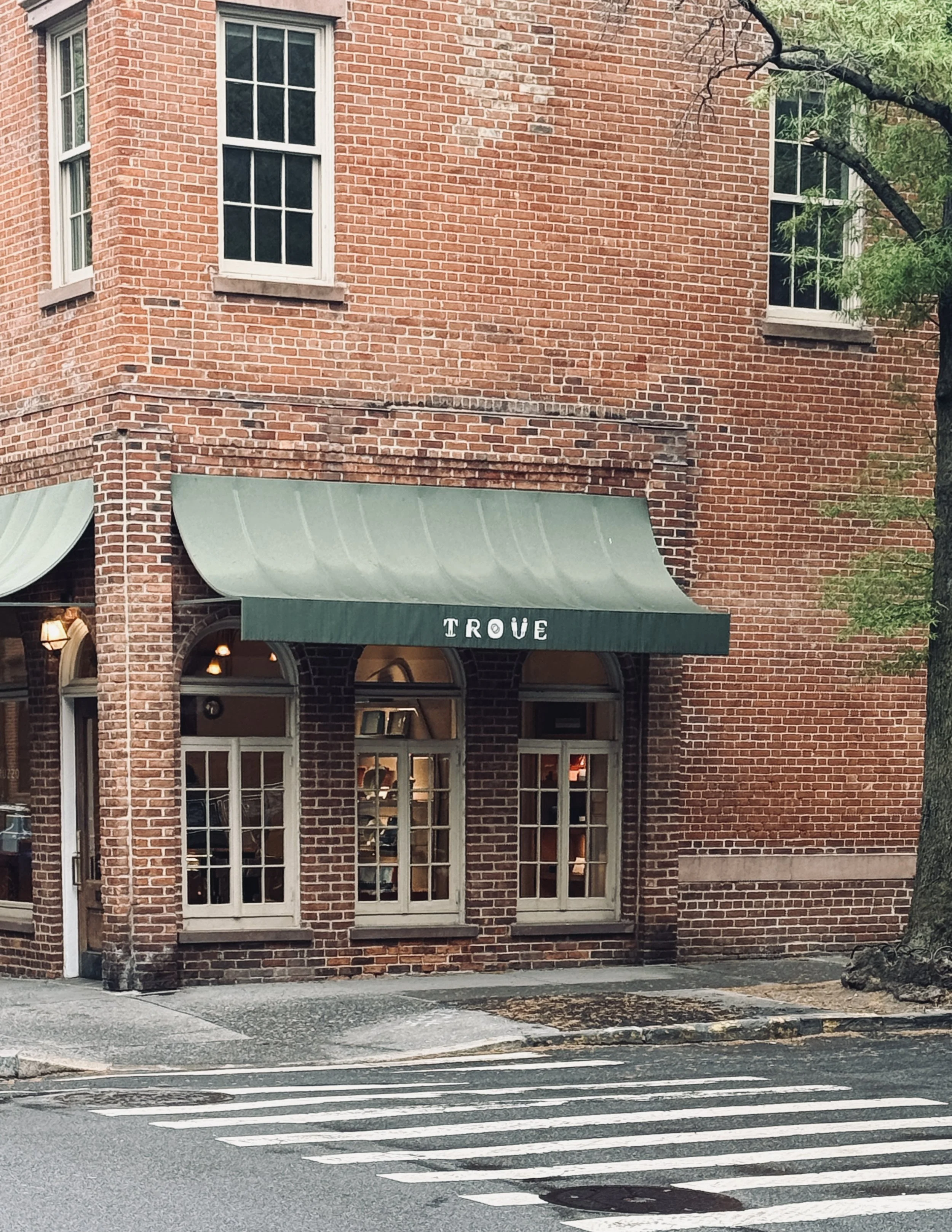
Sometimes, absolutely. I can be attracted to a storefront, a logo, a colour palette or a piece of typography before I even understand what the business actually does.
And sometimes that’s what I find particularly fascinating: when the visual identity itself makes something feel desirable, even if the business behind it isn’t necessarily what you would traditionally describe as “sexy” or attractive.
That, to me, is one of the real strengths of branding. You can take a business or a service that might seem quite ordinary and give it a personality, a world and a visual language that makes people want to engage with it.
I genuinely believe that almost any business can be made to feel edgy, interesting or desirable if you approach it with the right creative idea. You don’t necessarily need a glamorous product. You need a strong point of view.
That’s actually one of the challenges I enjoy most in my own work — finding the angle that makes a brand feel different and gives people a reason to notice it.
And then I love seeing how that identity develops across all the different touchpoints.
“When everything works together, branding becomes
an experience rather than just a logo.”

How important is consistency
in a visual identity?
For me, consistency is absolutely fundamental. One of the things I particularly notice in bars and restaurants is when the logo, typography, colours, menus, coasters, packaging and other touchpoints all feel as though they belong to the same world.
What I find really satisfying is when you can take one of those elements completely out of context and still recognise the brand.
You might see a coaster on its own, for example, or a branded bag, a menu or a piece of packaging, and immediately have a sense of which business it belongs to — without needing to see the logo or the storefront alongside it.
That’s when you know the visual identity has really been pushed through properly.
The opposite can be quite confusing. You sometimes come across businesses where the original identity might be perfectly good, but it isn’t applied consistently. The colours change from the shop to the website, the typography changes across different materials, the packaging feels completely disconnected from the physical space, and suddenly there is no coherent visual language.
And when everything is saying something slightly different, it becomes much harder for the audience to understand who you are or what you stand for.
For me, a strong visual identity should tell one clear story, wherever you encounter it.
“When everything works together, branding becomes
an experience rather than just a logo.”
Can tiny details influence the way you approach a brand project?
Absolutely, although I think it happens in a very unconscious way.
I’ve had an active eye for as long as I can remember. I’m naturally very aware of small details around me, sometimes things that other people might not necessarily notice. And I think I’ve been collecting those details — consciously or not — since I was very young.
It can happen anywhere. Sometimes it’s in the most ordinary place imaginable, and suddenly there is one tiny detail that catches my attention. It might be a shade, a visual detail, a graphic element, or simply the way something has been arranged. I don’t necessarily think, I’m going to use this in a project one day. I simply notice it, absorb it and remember it.
I think creativity works a little like that. It’s similar to an artist who visits hundreds of exhibitions, looks at paintings, photographs, architecture, landscapes and people, and then creates something years later. What they create isn’t necessarily a direct reference to one particular thing they saw. It’s a combination of everything their brain has absorbed, connected and — importantly — loved.
“We are constantly collecting visual
information without even realising it.”
For me, travelling, walking through cities, visiting galleries, eating somewhere beautiful, noticing a shopfront or simply observing everyday life all become part of that visual library. Eventually, your brain does the work of connecting those fragments in ways you might not even consciously understand.
So yes, those tiny details absolutely influence my work. Just not always in an obvious or immediate way.
What makes an identity feel timeless rather than simply fashionable?
I think there’s a very fine balance between understanding what is current and becoming too dependent on trends.
It’s a little like interior design. If you follow a particular colour, material or style simply because it’s everywhere right now, you can almost guarantee that in a few years you’ll have seen it so many times that you’ll be completely tired of it. And once the trend has passed, the design can suddenly feel very dated.
Branding is no different.
That doesn’t mean you should ignore trends altogether. Of course, people are influenced by what feels contemporary, and brands need to exist within their cultural moment. But I think the key is knowing how much of that language to borrow without losing your own personality. And a visual identity is meant to stand the test of time, so by not following current trends too closely, we reduce the risk of it quickly feeling dated.
For me, the most interesting identities find that balance. They might feel contemporary, but there is something underneath that is much more enduring — a strong idea, a clear point of view and a visual language that belongs specifically to that brand.
Sometimes that means using something very simple and considered. Other times, it means doing the complete opposite: taking a trend or a familiar visual code and pushing it much further than expected.
And that’s something I really admire in designers — whether they work in branding, interiors, fashion or any other creative discipline — when they are prepared to take risks and step outside the usual codes.
I wouldn’t describe myself as hugely extravagant in my own design style. I like simplicity and I’m conscious of creating something that can last. But I also love a challenge, and I’m very drawn to people who are brave enough to push an idea much further than most would.
“For me, timeless doesn’t mean safe. It means
distinctive enough to survive the trend.”
“In New York, inspiration is everywhere,
if you know how to look”
What makes New York particularly
inspiring from a branding perspective?
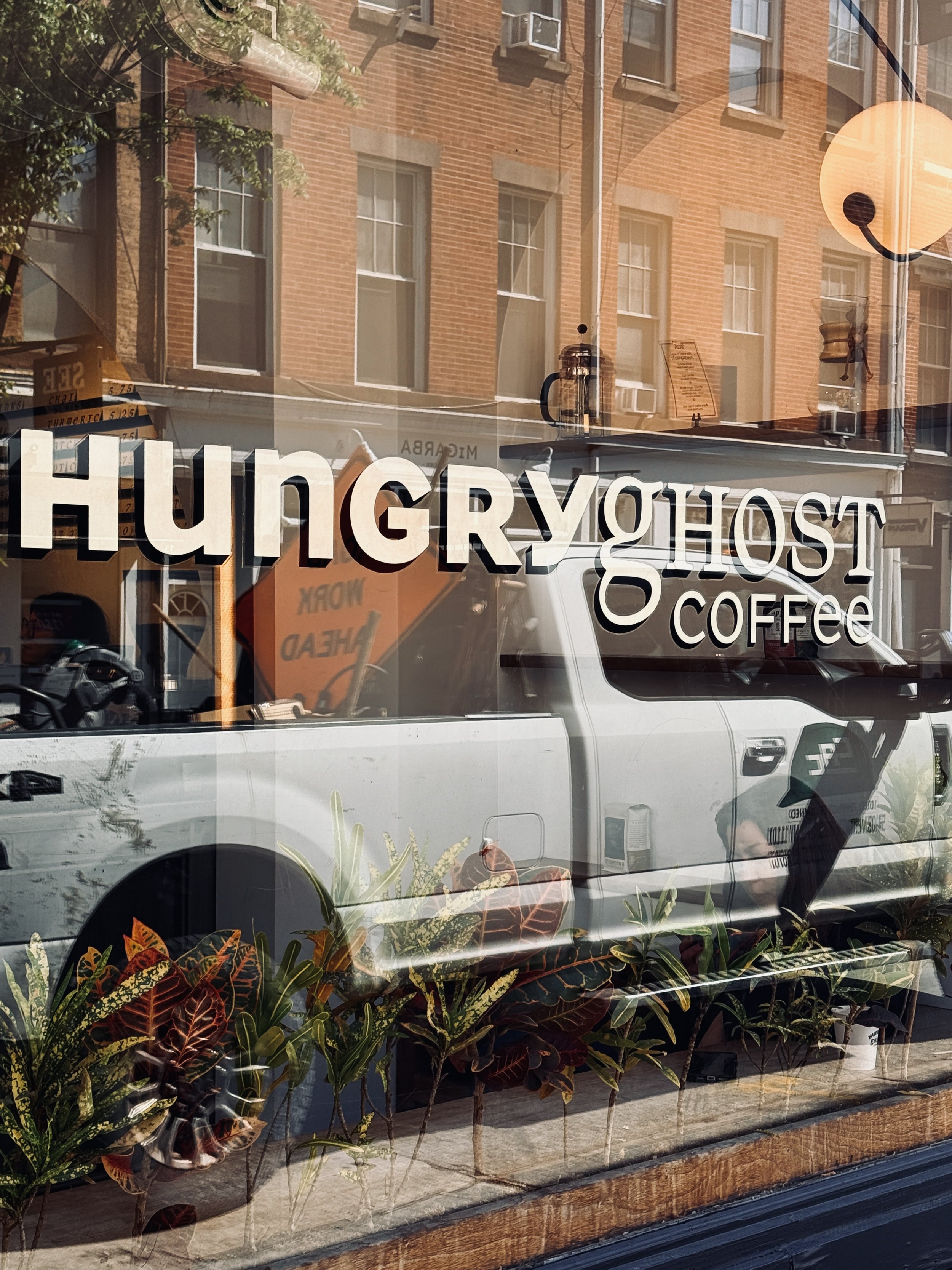
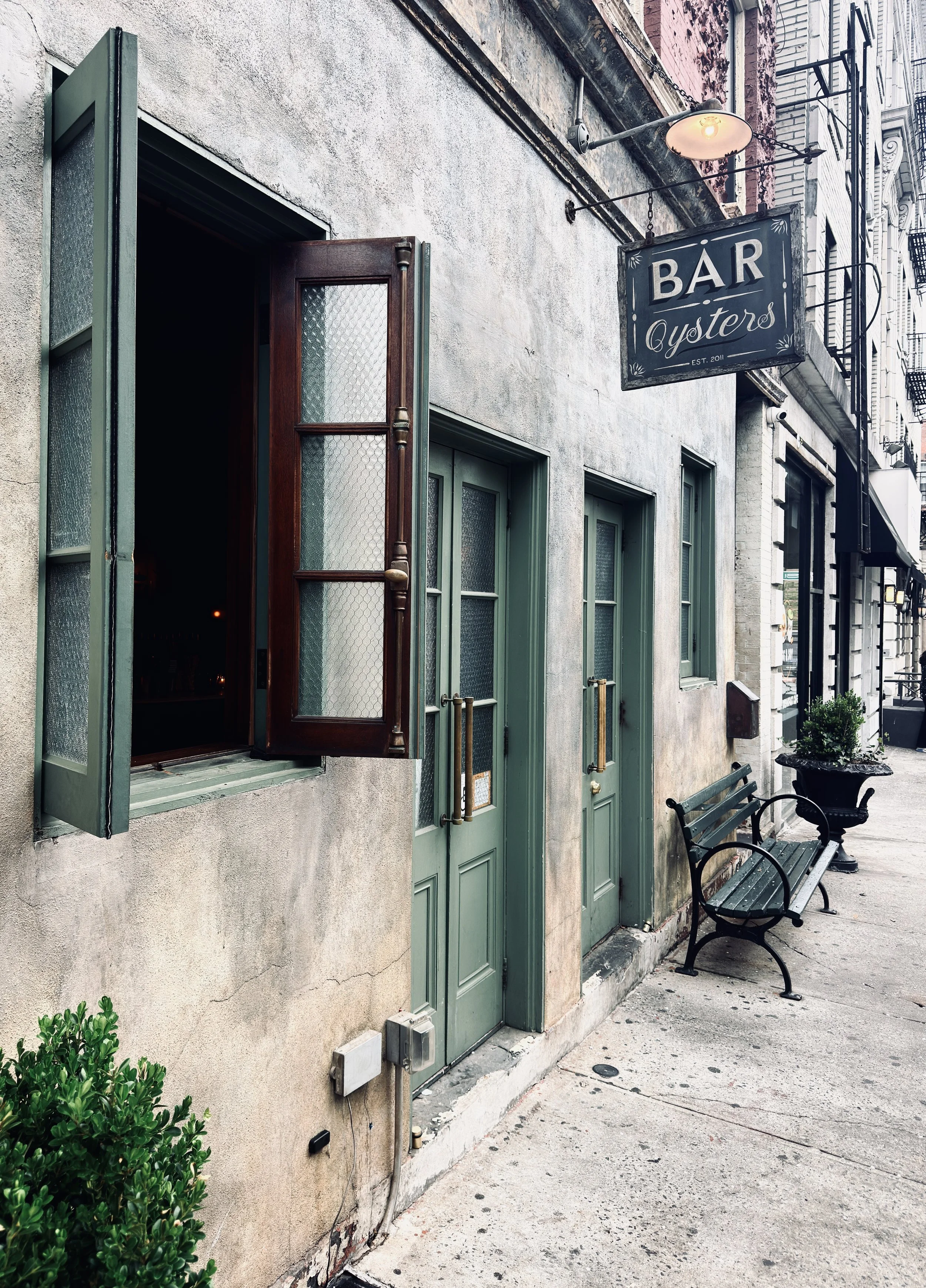
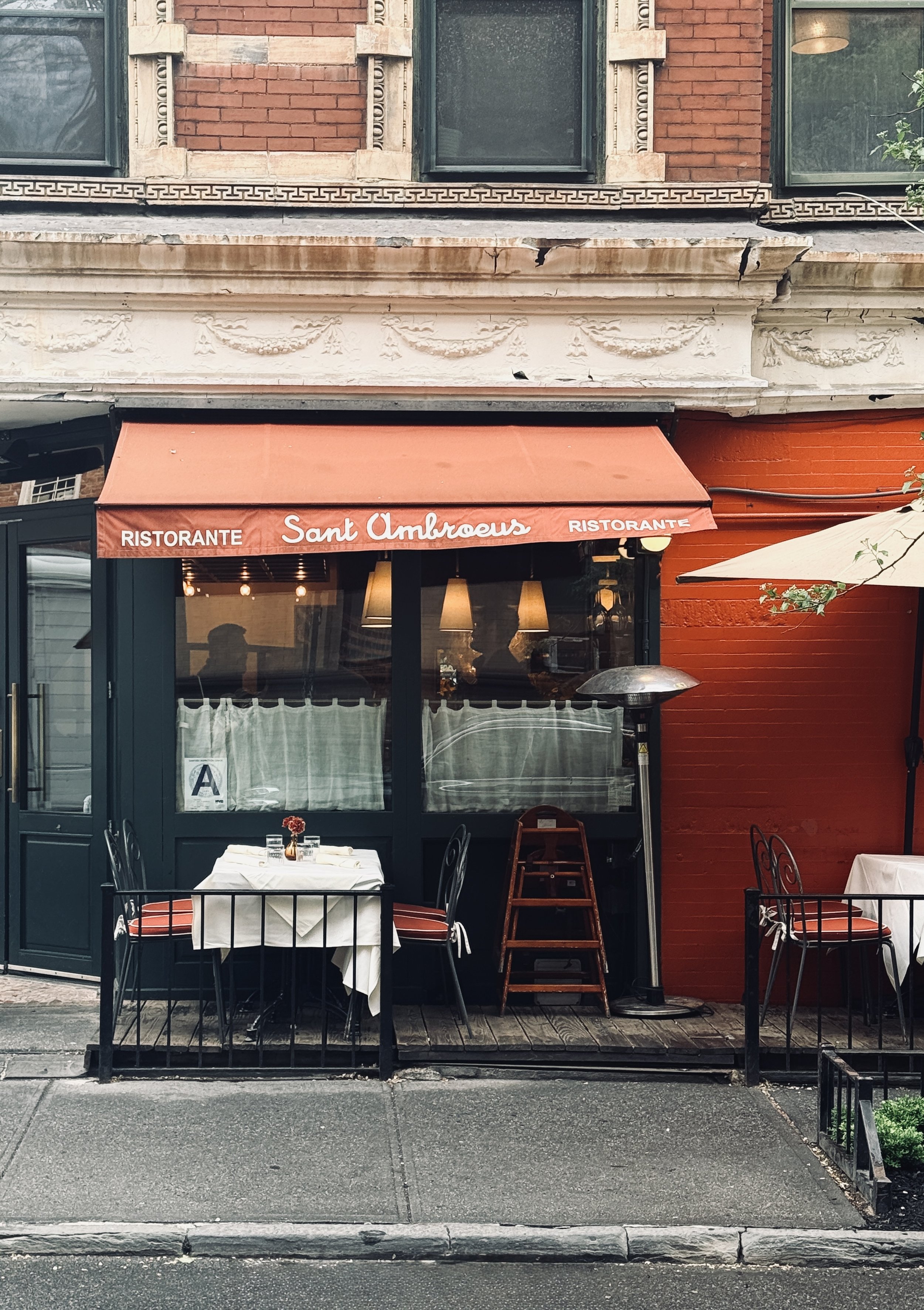
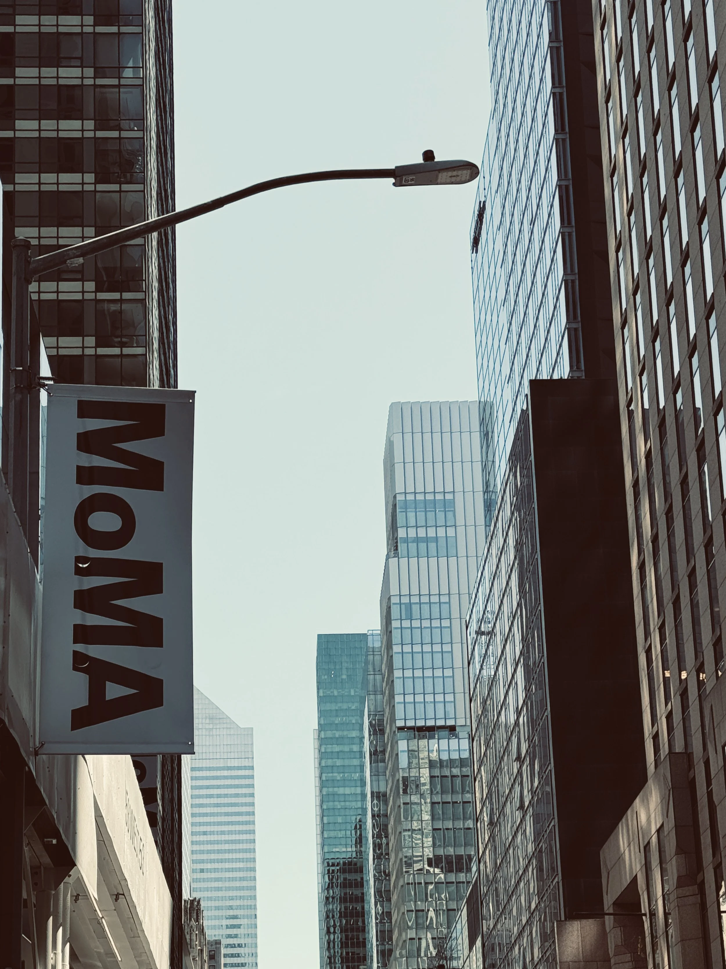
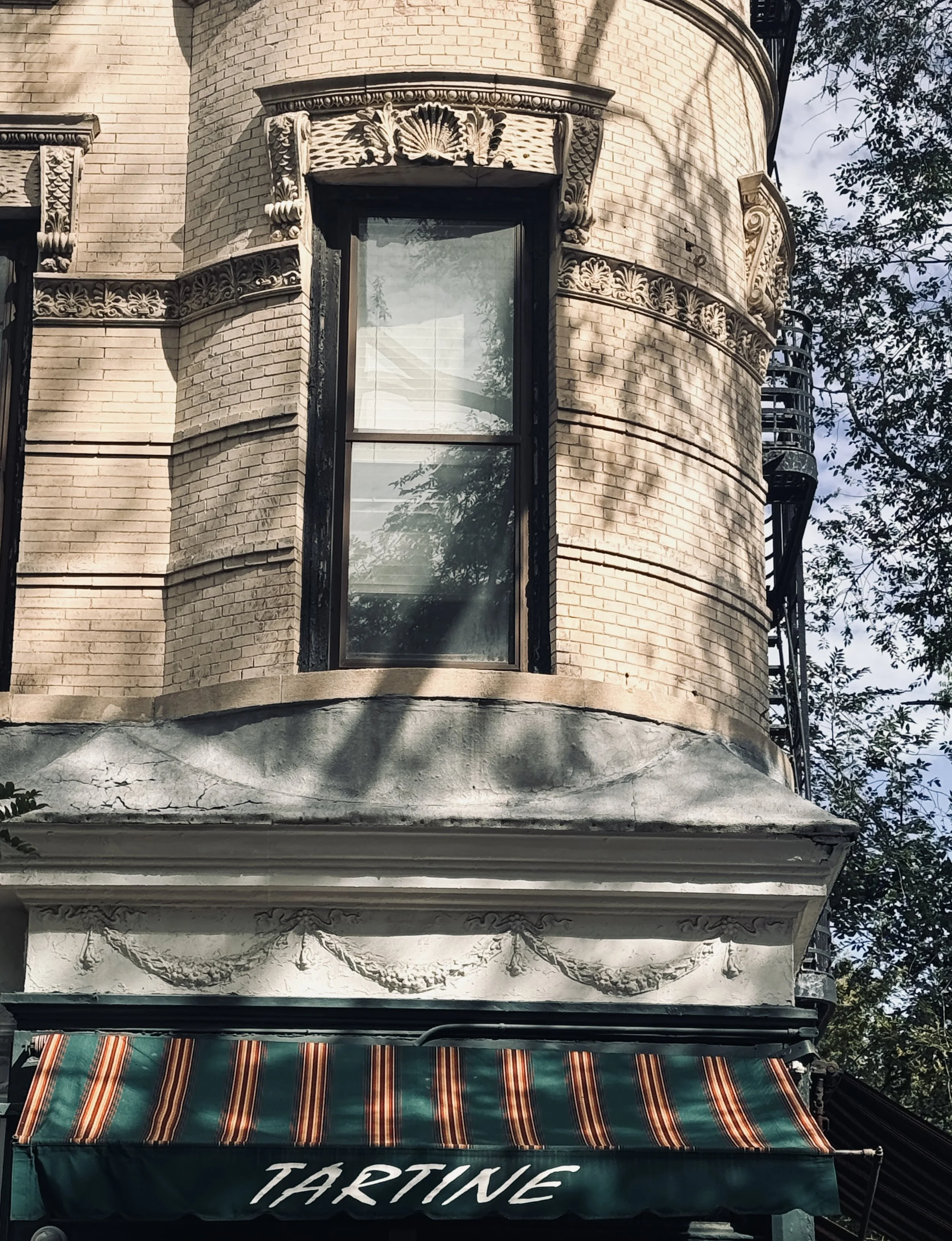
New York is incredibly inspiring because there is simply so much happening visually. Within just a few streets, you can find restaurants, cafés, boutiques, hotels, galleries and independent businesses, each with its own visual identity. There is this incredible density of brands and ideas, and they all coexist side by side.
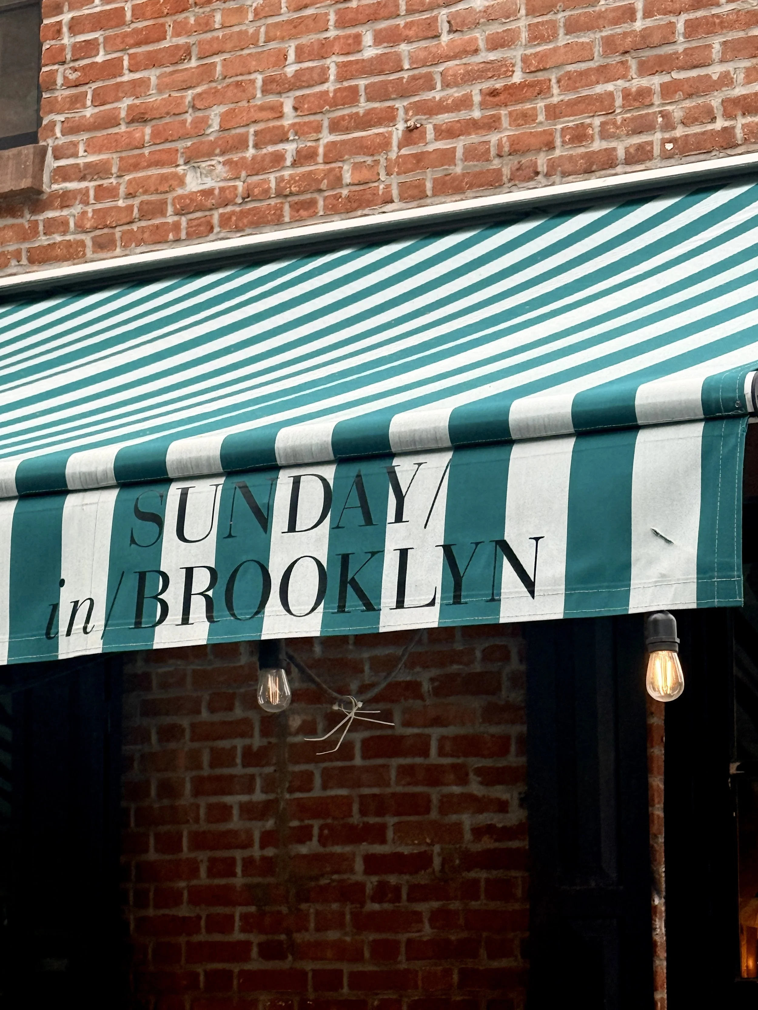
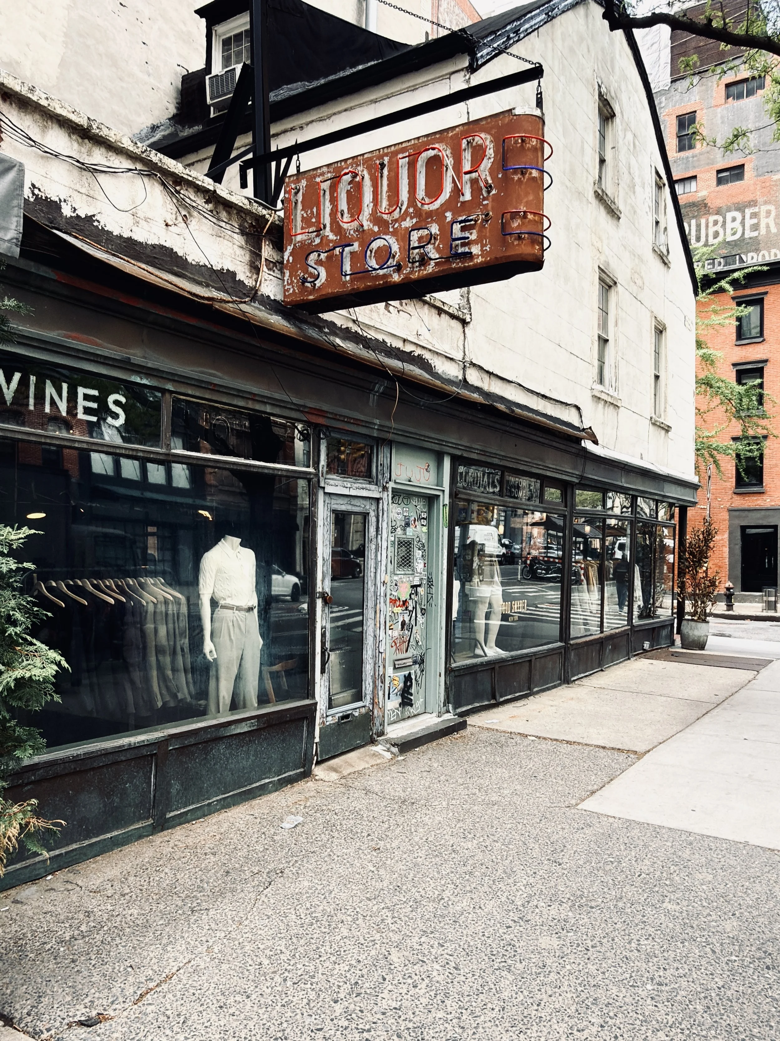
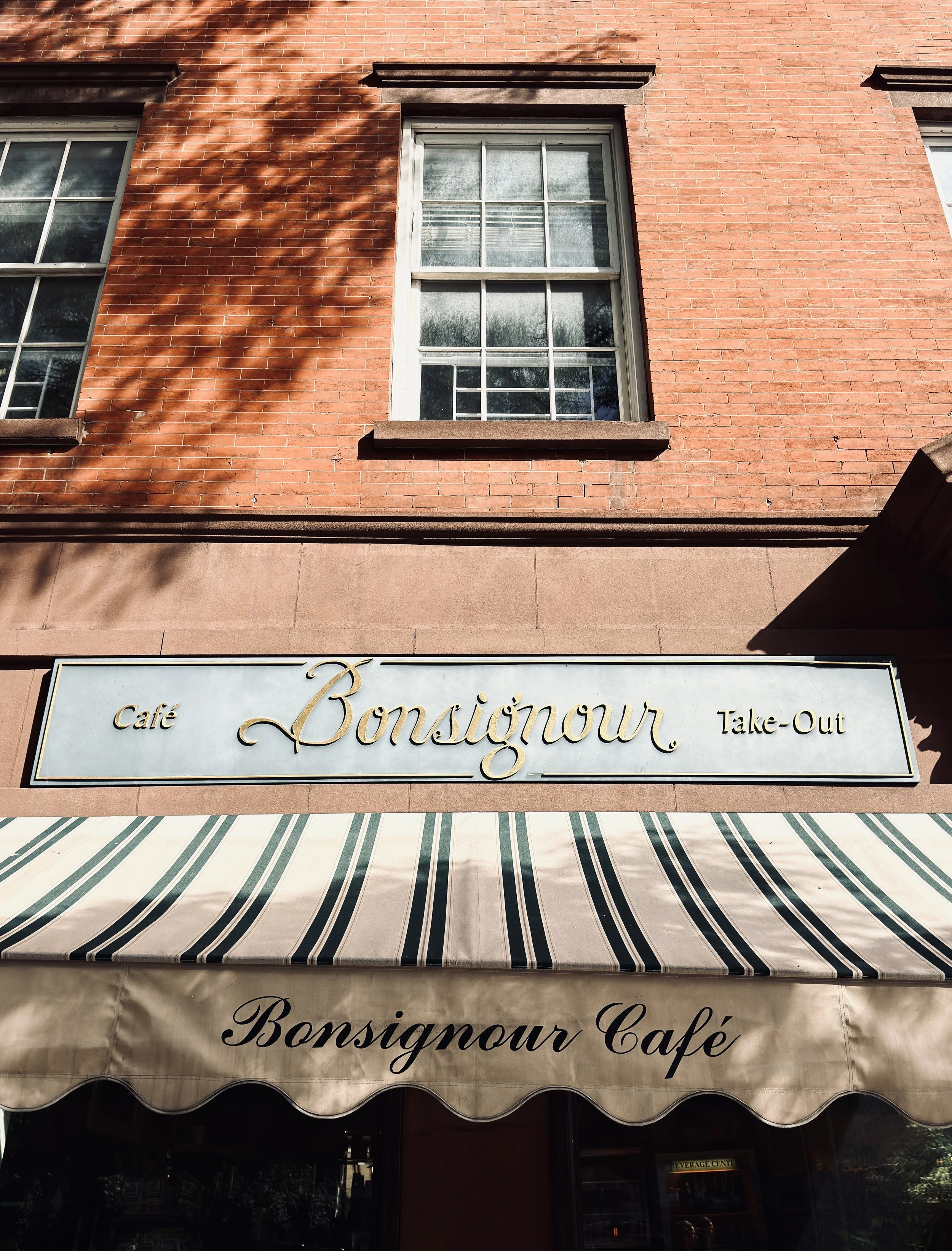
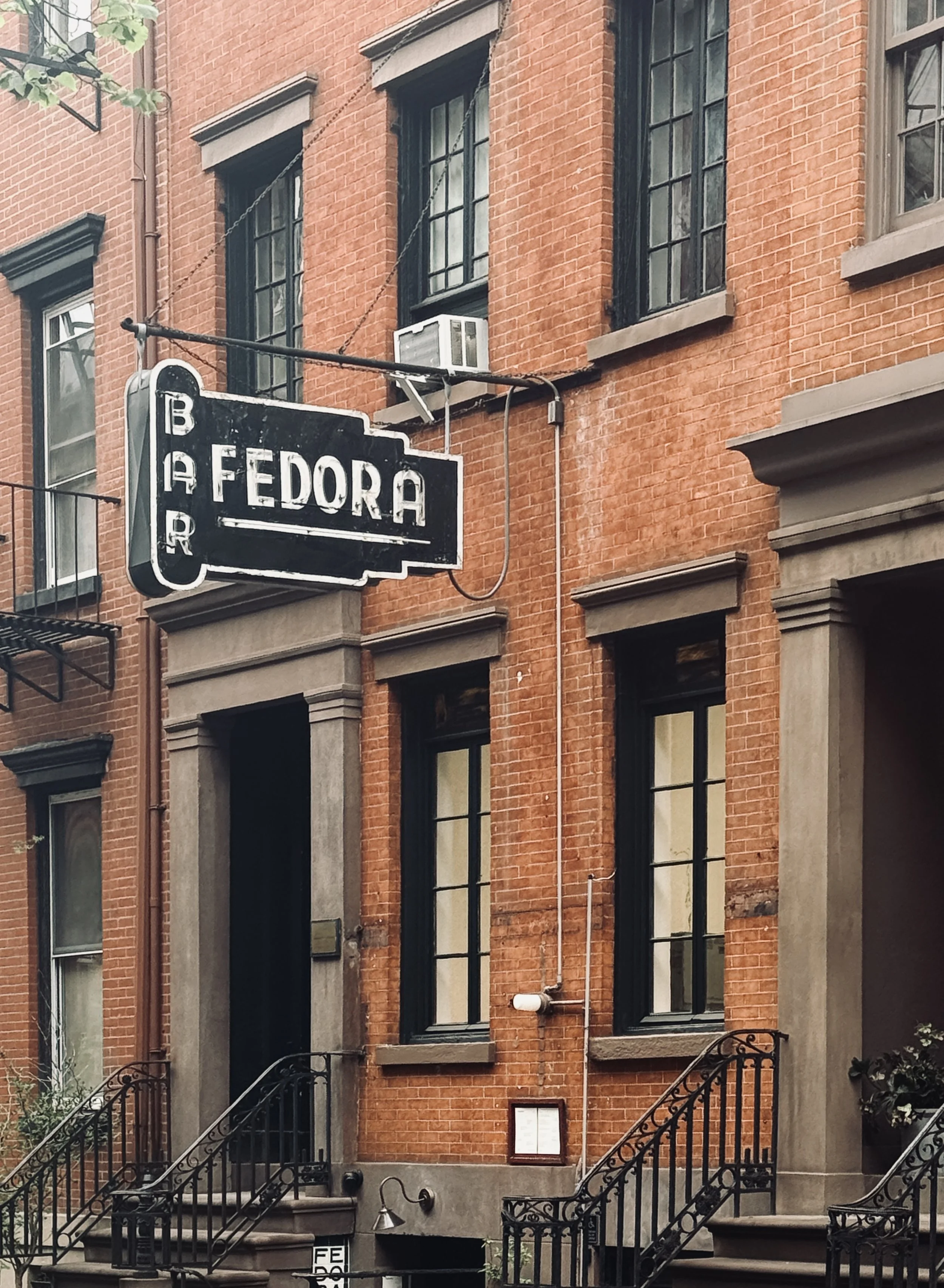
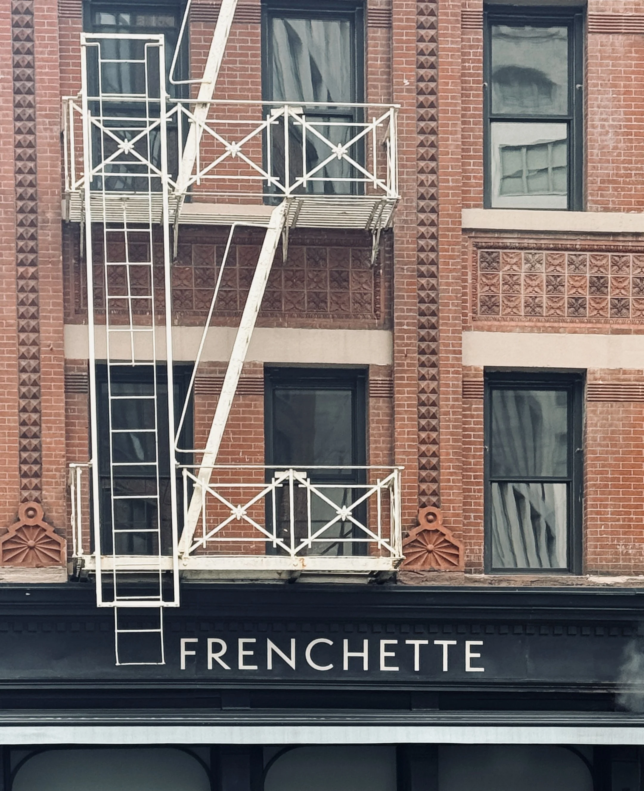
I particularly notice it in neighbourhoods like the West Village, where the scale feels much more intimate. The architecture plays a big part in that. You have these beautiful historic buildings, brick façades, little stoops and streets that twist and turn rather than following the huge grid you associate with so much of Manhattan. It almost has the feeling of a village within the city.
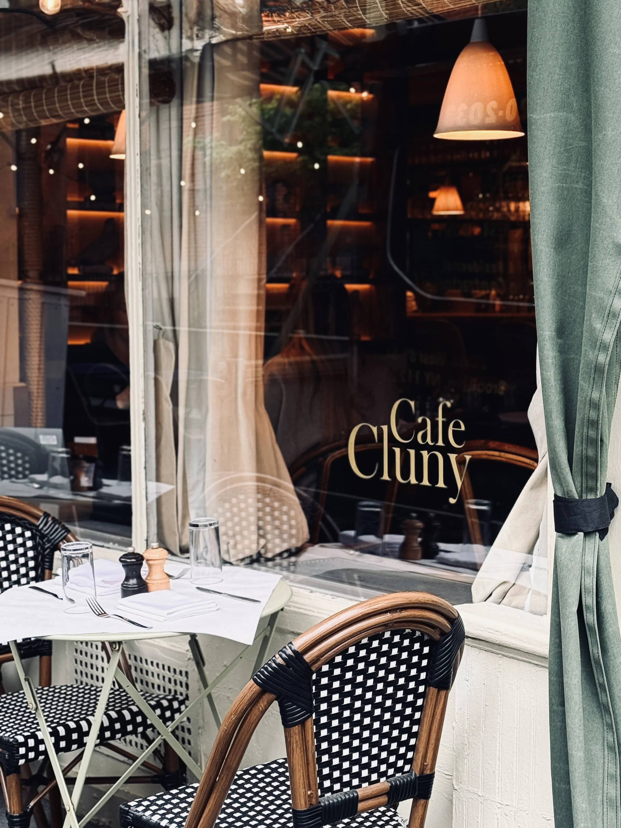
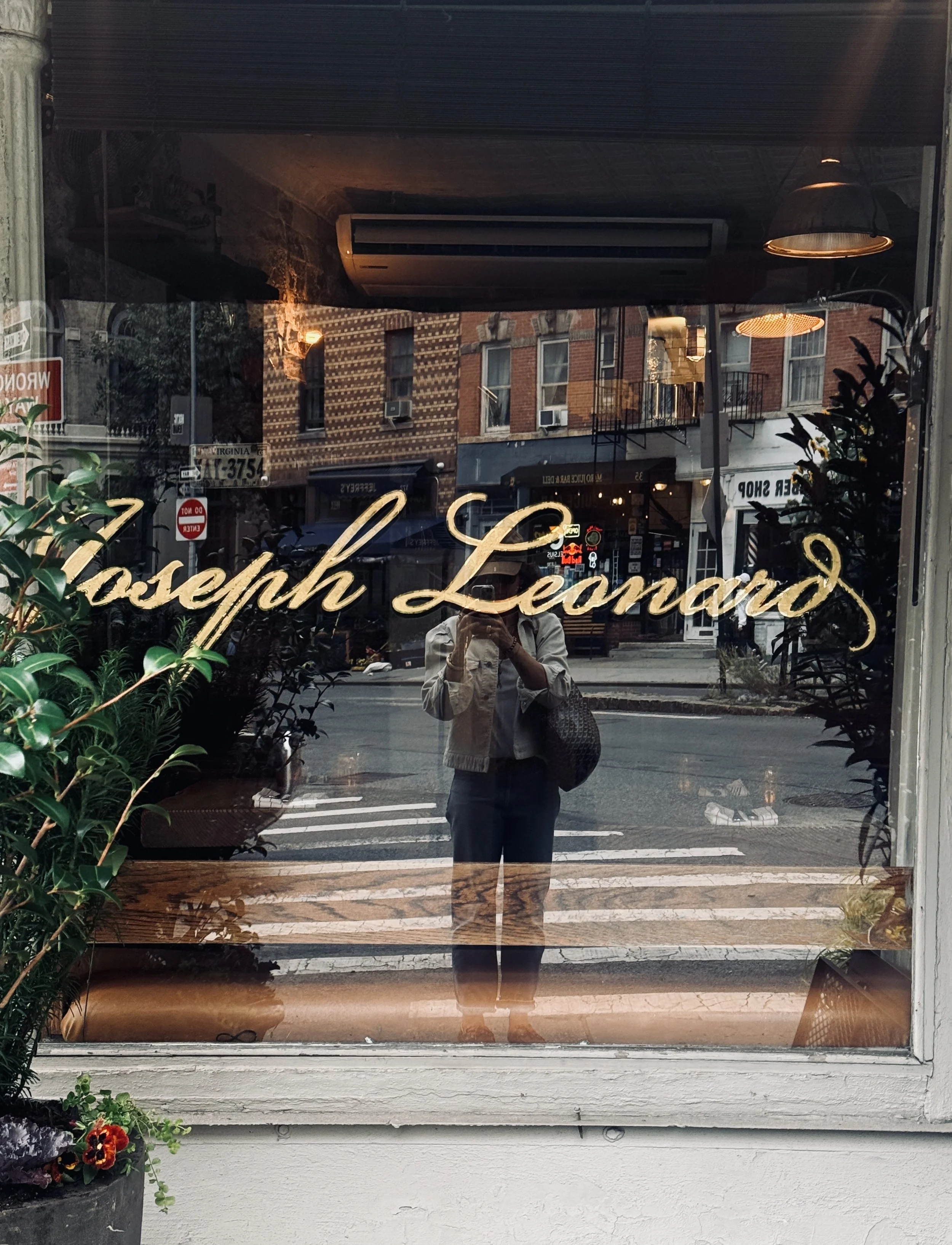
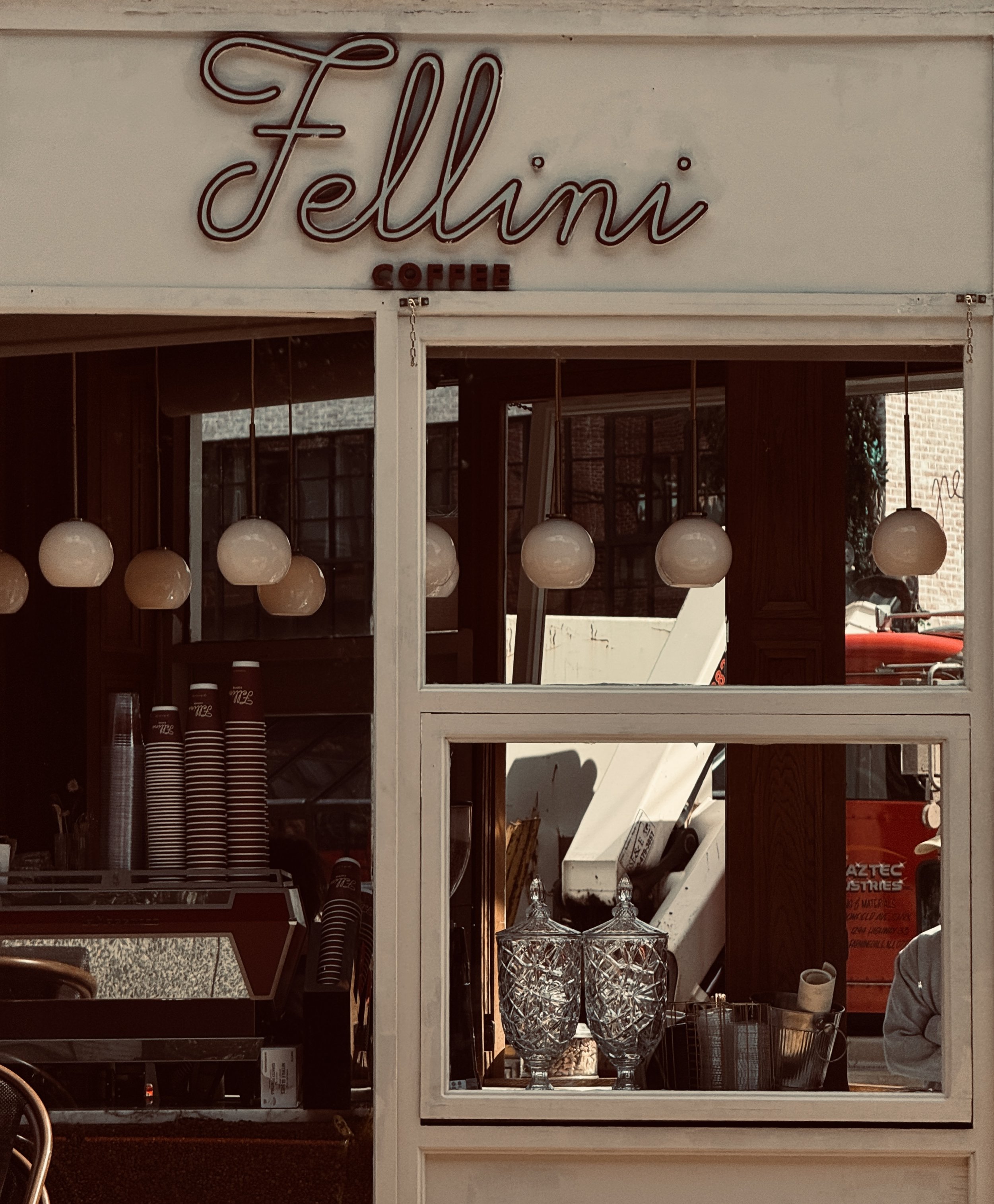
That contrast is what I love about New York. The city can feel enormous and overwhelming, surrounded by skyscrapers and huge avenues where you feel very small. But then you turn a corner and suddenly you are somewhere much more intimate, with a tiny restaurant, an independent shop, a beautifully designed café or a really distinctive storefront.
“That’s where I find myself looking the most closely.”
The West Village is probably the neighbourhood where I feel most at ease and most inspired visually. I think I’m naturally drawn to places that have a strong sense of personality without feeling too polished or corporate. It reminds me a little of what I love about Marylebone in London or the Marais in Paris — neighbourhoods where you can walk around without really knowing what you’ll find next.
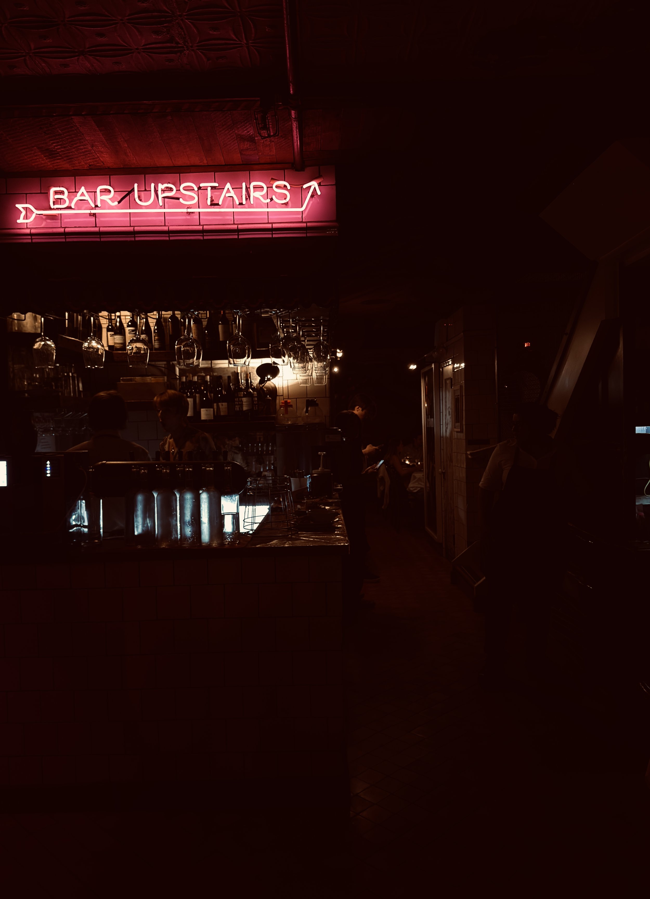
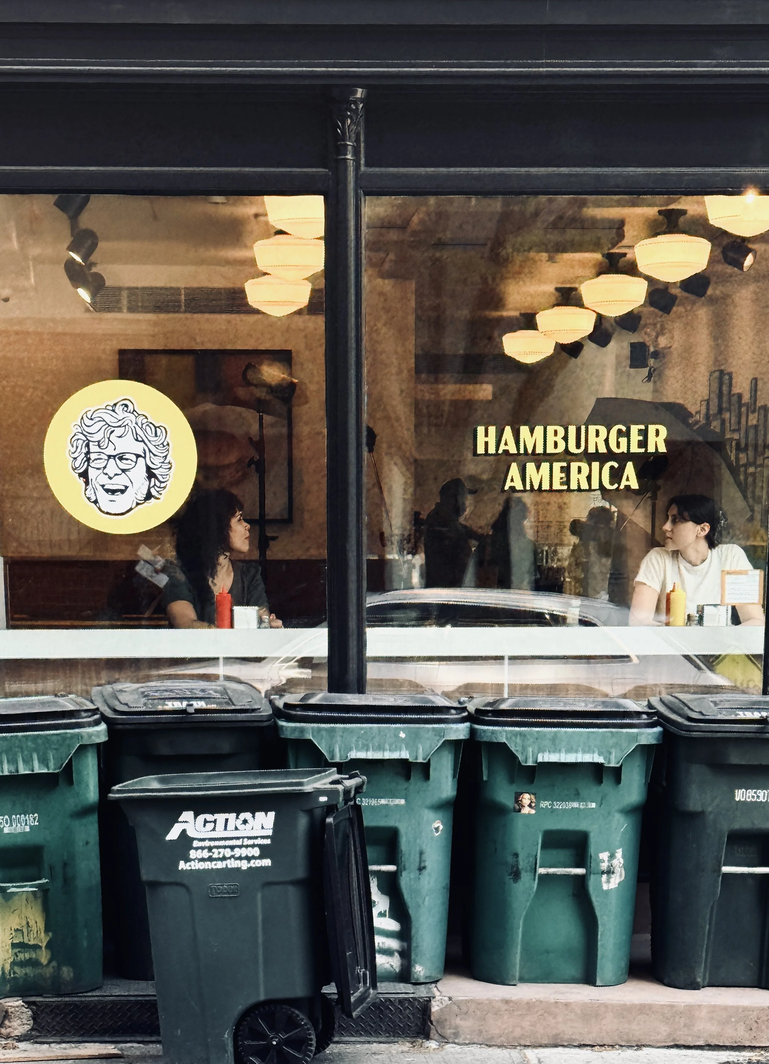
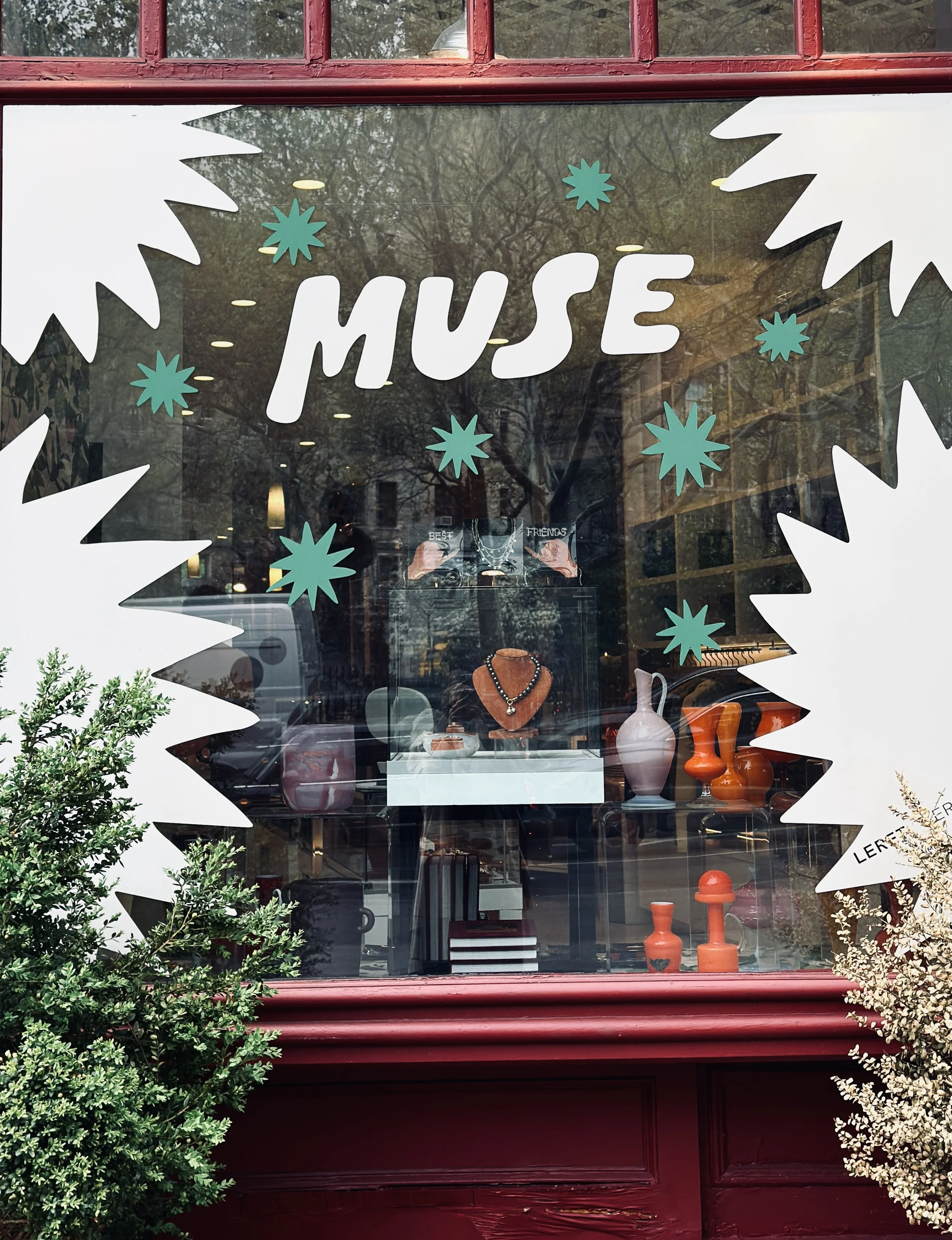
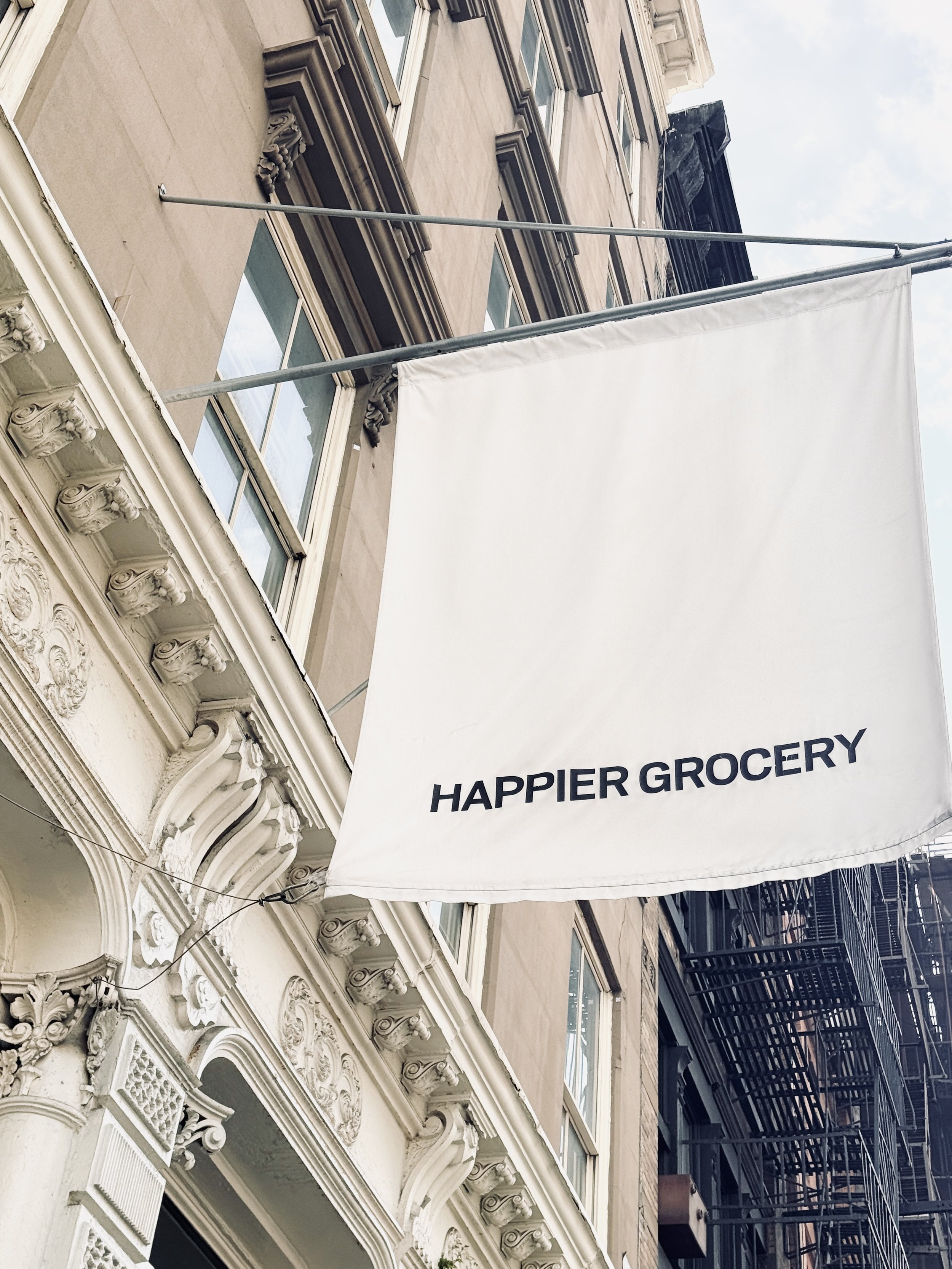
And then there is the sheer amount of design. You see interesting identities everywhere: on storefronts, menus, packaging, signage, uniforms, merchandise. It becomes a constant source of visual references. New York has such a strong creative and cultural history too, particularly in areas like Brooklyn, Greenwich Village, West Village, Soho, Noho, Nolita, Tribeca, Meatpacking, which has long been associated with artists, musicians, writers and alternative culture.
For me, all of those layers — architecture, independent businesses, food, culture and design — make the city incredibly rich visually.
What is it about typography
that catches your eye?
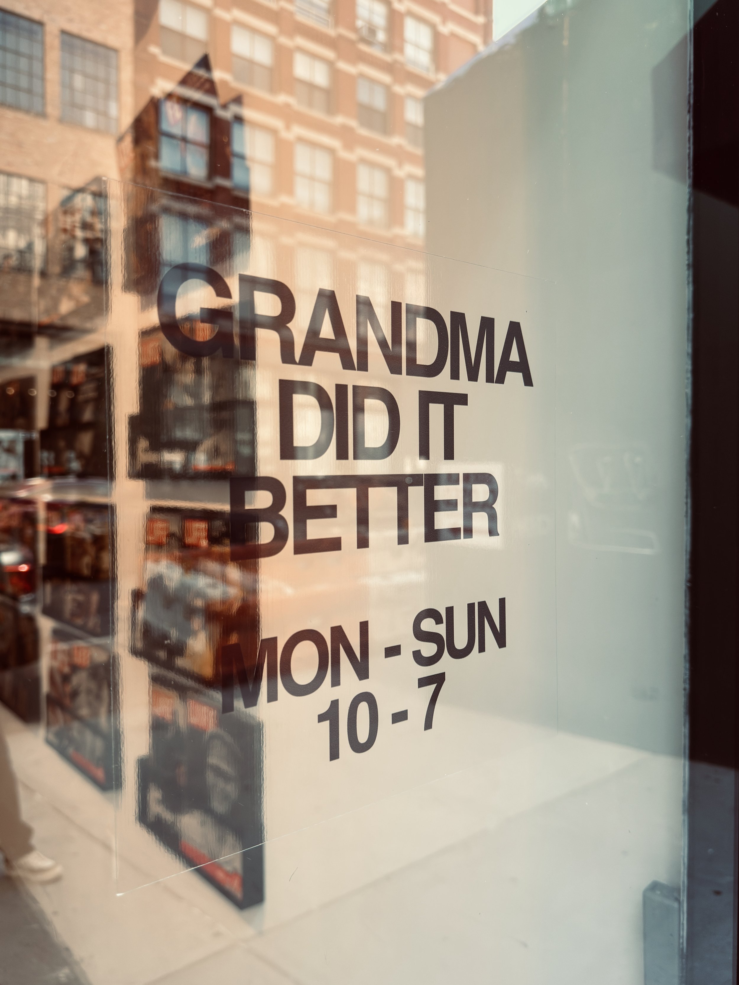
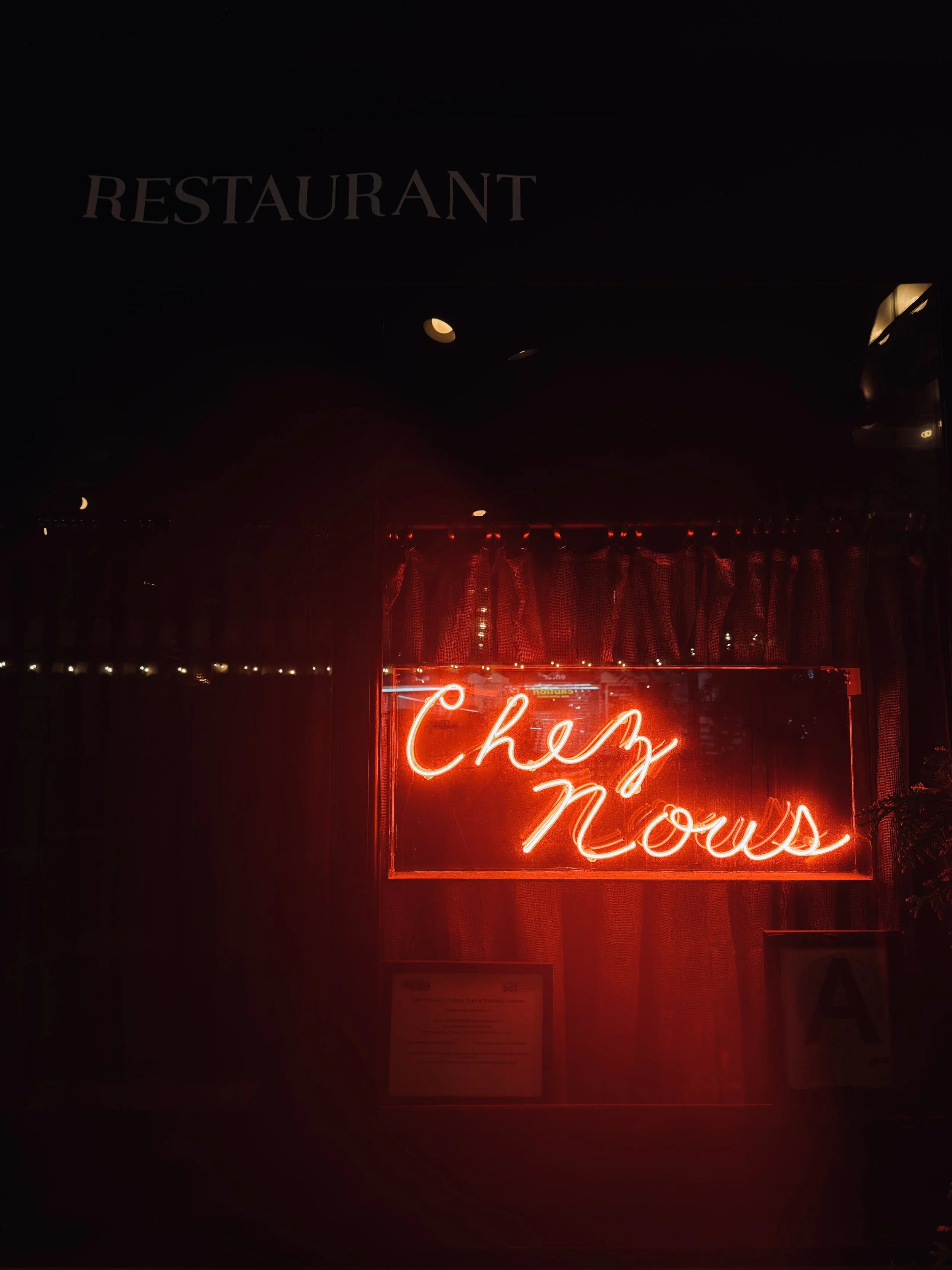
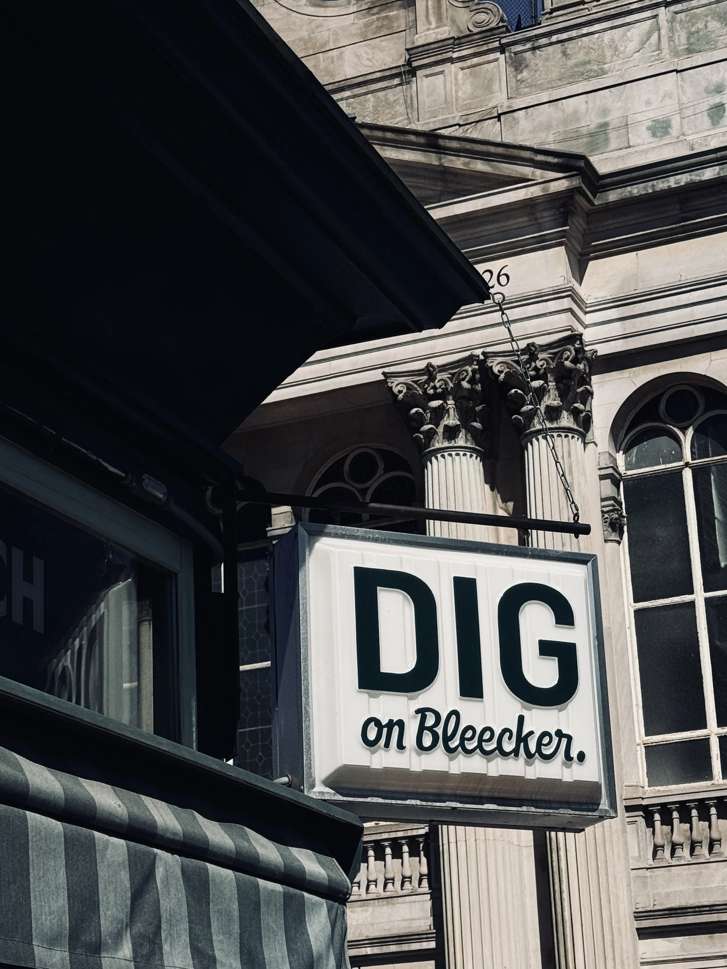
I tend to be drawn to a fairly specific type of typography. I often like bold typefaces, but ones that still feel relatively minimal and considered. I’m not necessarily looking for something complicated or overly decorative.
For me, it’s often about what you do with something simple.
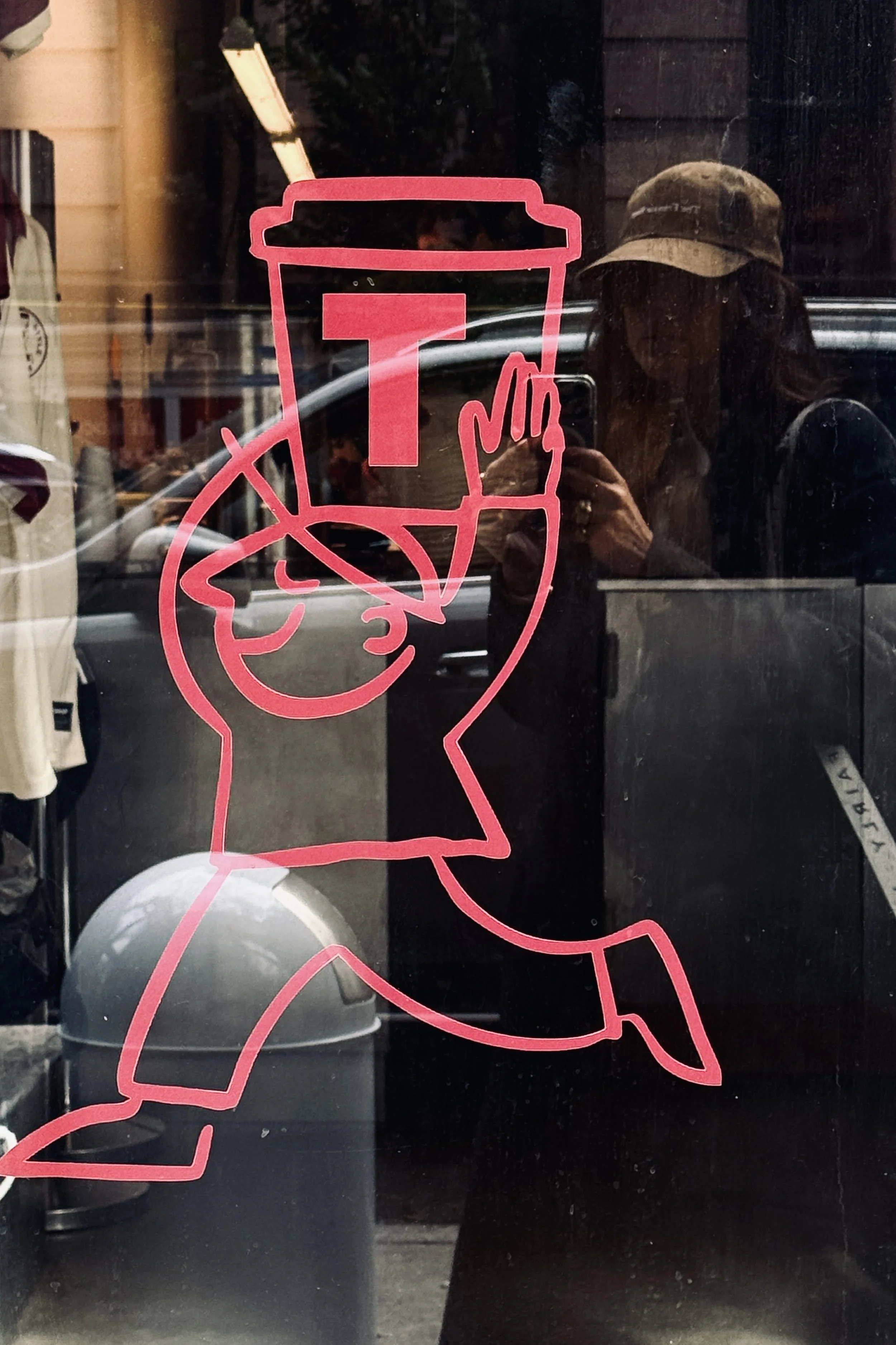
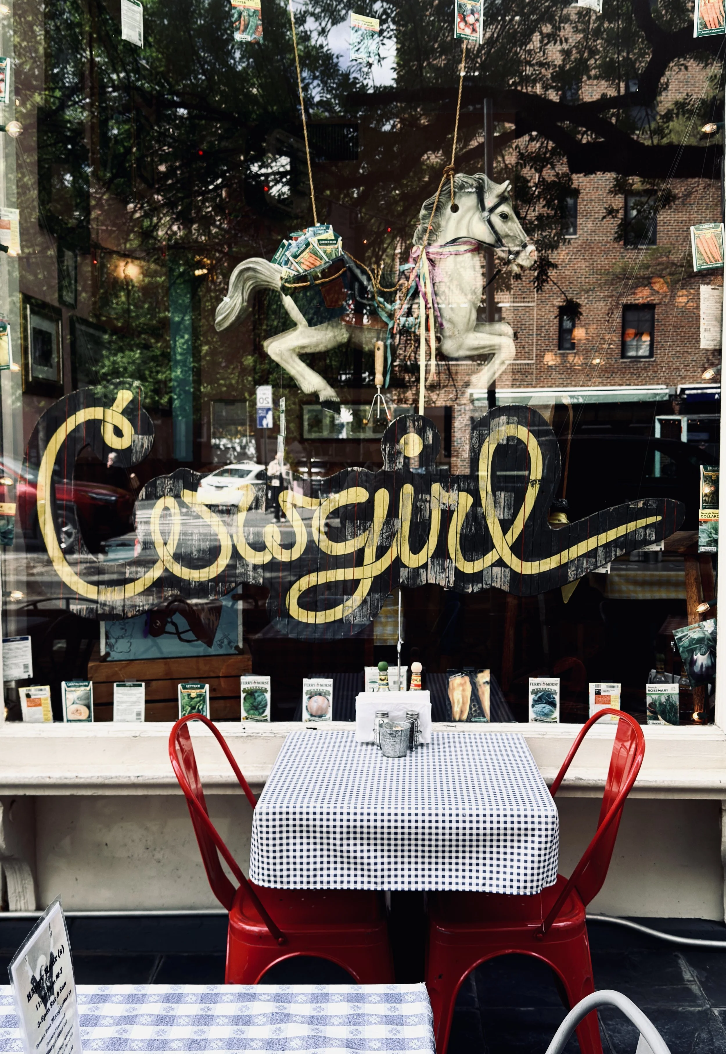
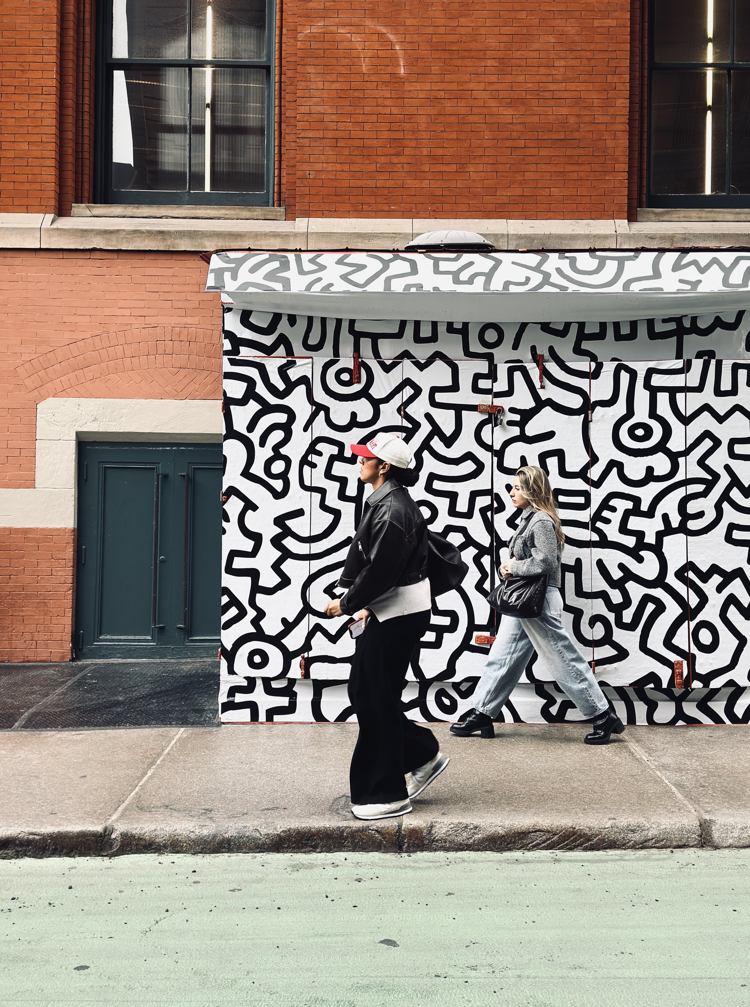
You can start with the most basic, minimal typeface and still create a really distinctive identity if you introduce one unexpected element — a particular colour, a symbol, a hand-drawn logo, an unusual detail or a slightly different way of using the type.
“You don’t always need more. Sometimes
you just need one thing that makes it yours.”
That small detail can completely change the personality of an identity and make it stand apart from everything around it. And that’s often what catches my eye when I’m walking through a city.
It’s also something I try to bring into my own work. I’m much more interested in finding that distinctive detail than in adding elements simply for the sake of making a design feel more elaborate.
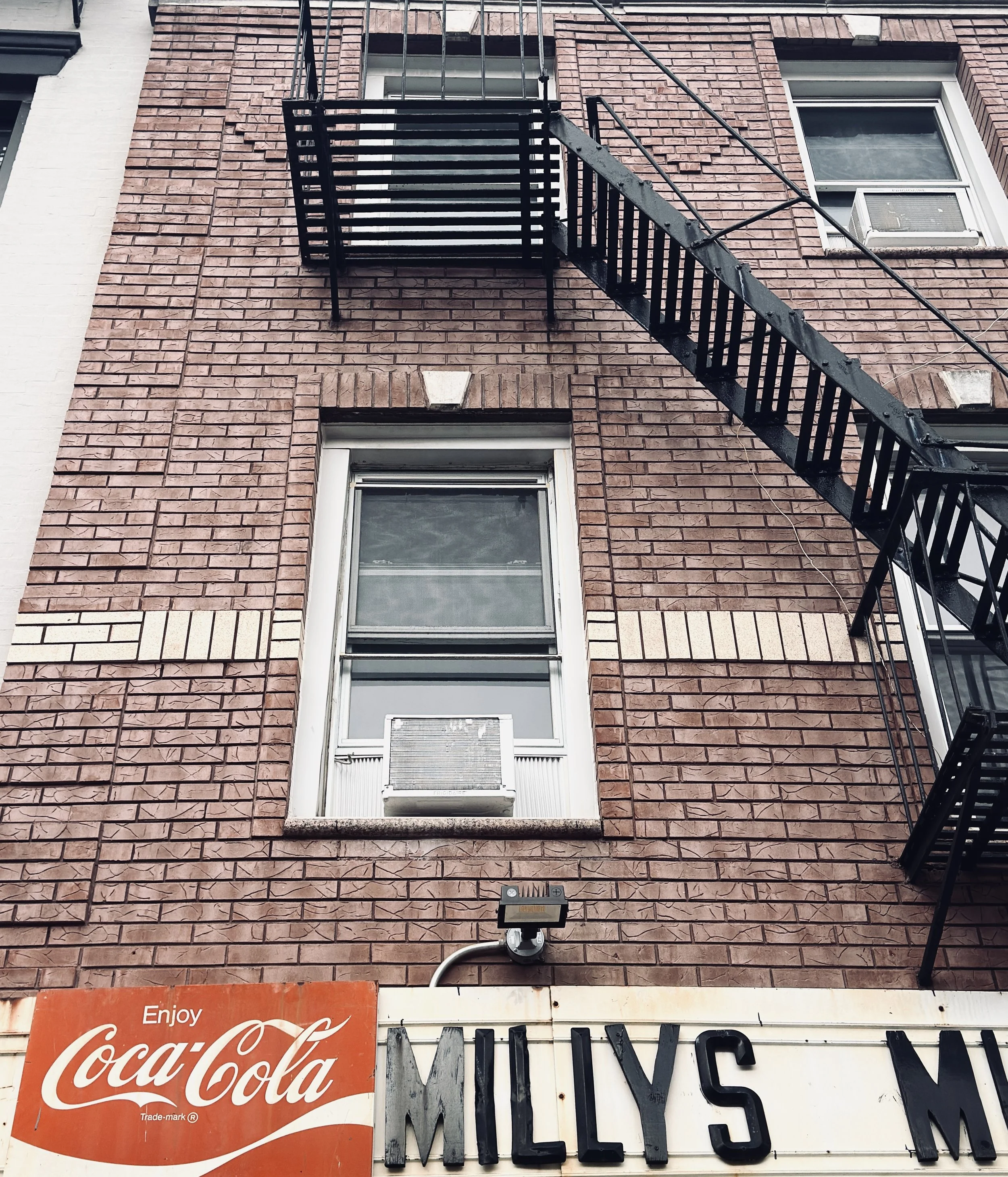
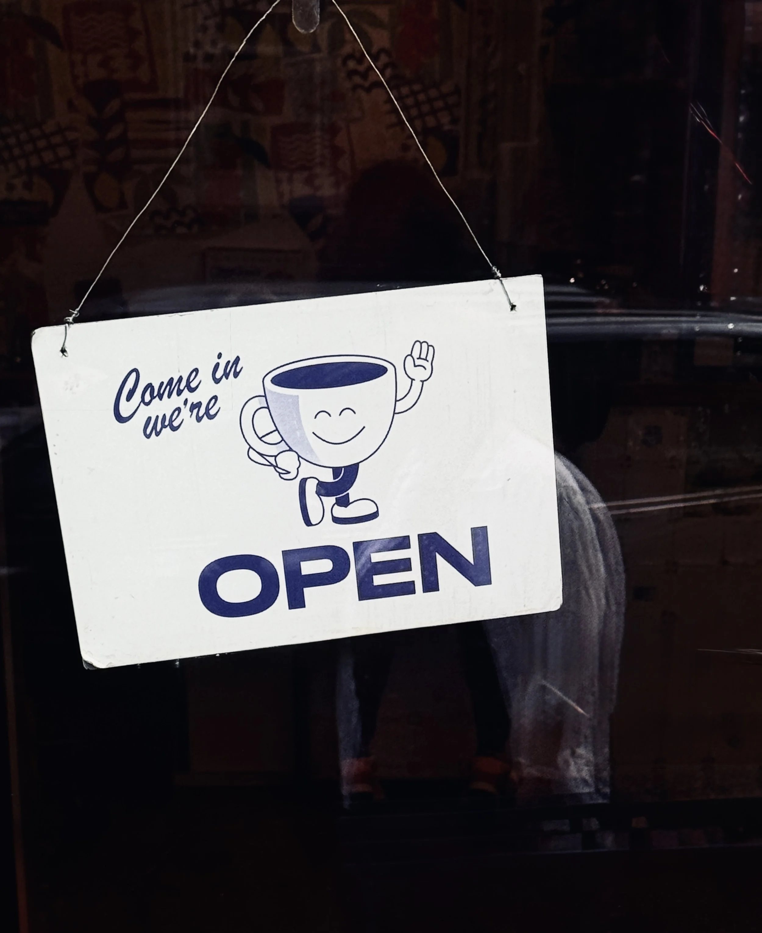
Do you photograph things you know you will use?
Not necessarily. Quite often, I photograph something simply because it inspires me in that moment.
I have lots of little collections and photo archives that I’ve built up over the years — details that I’ve noticed while travelling. I keep them almost like visual reference libraries, and sometimes I’ll come back to them much later when I’m looking for inspiration for a project.
Of course, these days there is also Instagram and social media. If something is particularly photographic and fits naturally with my own visual world, I might share it there. Some of those images also make their way onto my website.
But I don’t photograph everything with a specific purpose in mind.
Sometimes it’s much more instinctive than that. I see something, it catches my eye, and I want to capture it.
“It’s a little like collecting visual fragments.”
I might use them later, or I might never use them at all. But I like having that archive of things that have inspired me at a particular moment. Over time, those fragments become part of the visual library that feeds my work.
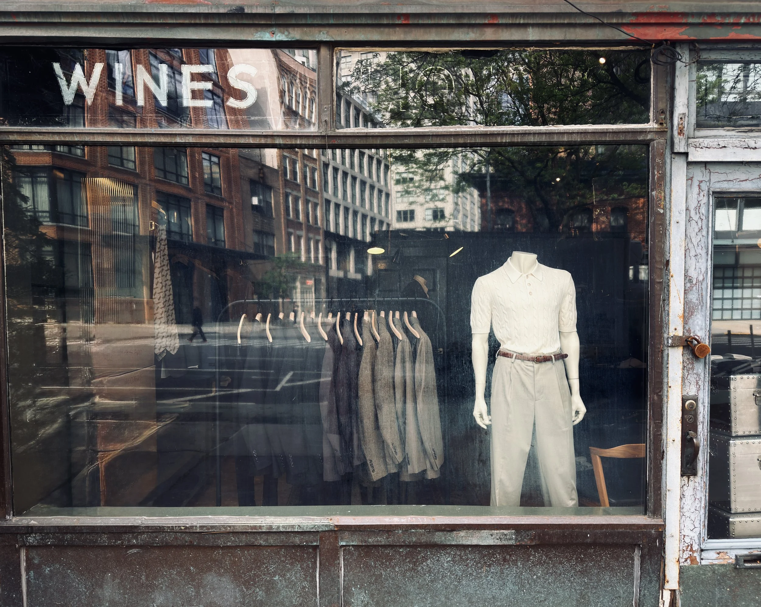
What do you think independent New York businesses understand particularly well about branding?
I think one thing many independent New York businesses do particularly well is create a very strong sense of personality. They don’t necessarily try to appeal to everyone. Instead, they know who they are and who they want to attract.
You see it in cafés, restaurants, boutiques and small businesses that have created an entire world around what they do. The identity can feel very specific, sometimes even quite niche, but that’s precisely what makes it appealing to the right people.
There is also something interesting about the creative ecosystem of a big city. Cities tend to attract designers, artists and people working in creative industries, partly because of the concentration of universities, art schools, cultural institutions and opportunities. Then you have a much larger population and a huge number of independent businesses, which creates an environment where new ideas can develop and interact.
And I think that creates a kind of creative energy of its own.
Sometimes we assume that having another business similar to yours open nearby would be competition. But actually, it can create a destination. If one street has four great interior design shops, for example, people might not travel there for just one of them — they’ll come because they know it’s the place to discover interiors.
“Creativity creates more creativity.”
You are surrounded by people who are experimenting, designing, making things and trying new ideas. You see what other people are doing, you get inspired, you challenge yourself, and that energy feeds back into the wider neighbourhood.
I think that’s one of the things I find so exciting about cities like New York: you can actually feel that exchange happening around you.

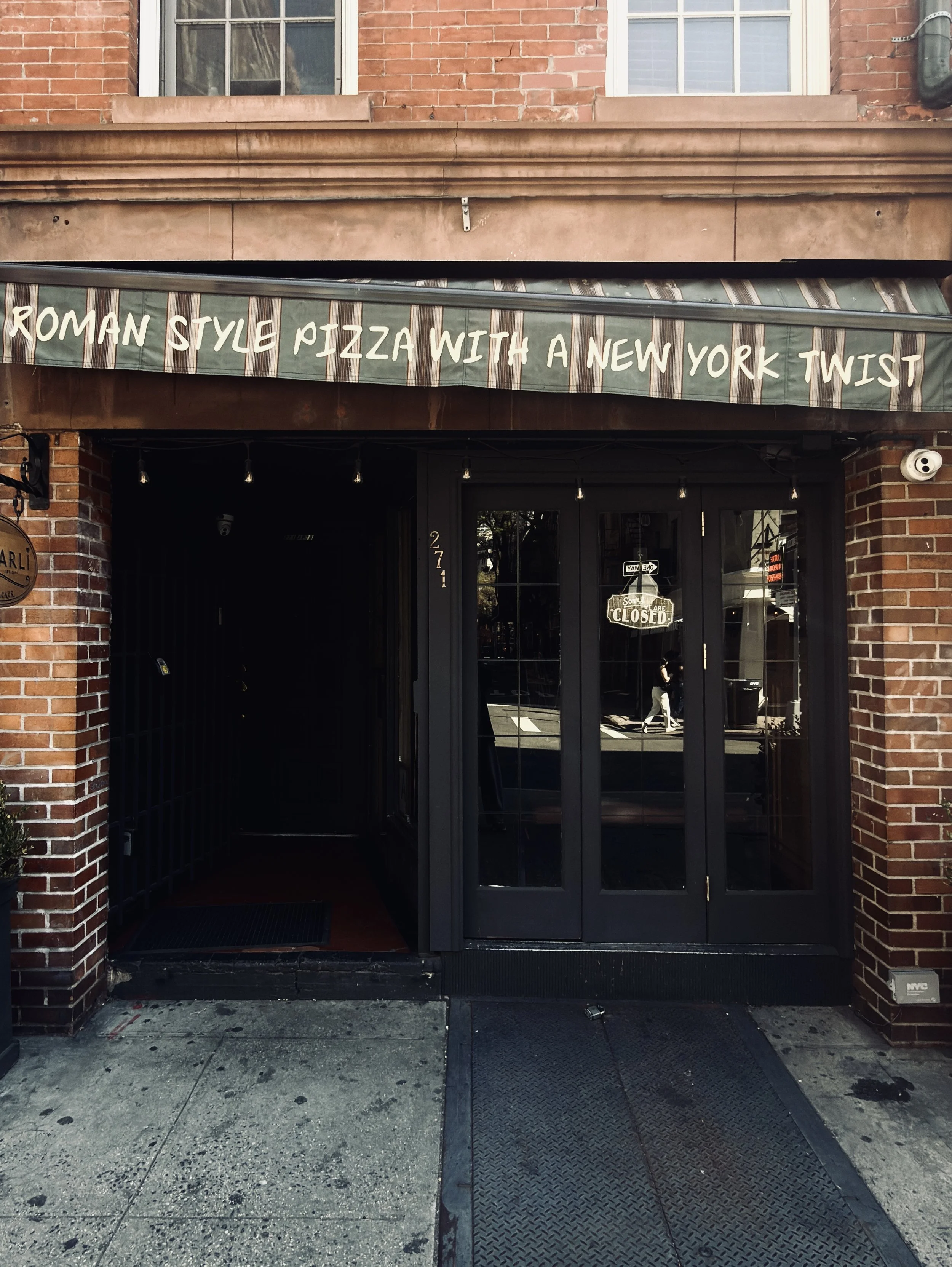
What do you think designers can learn simply by paying more attention to the world around them?
Curiosity, observation and visual culture are probably some of the most valuable things a designer can develop.
We live in an incredibly digital world. We are constantly connected, constantly looking at screens, consuming images and moving from one piece of content to another. But I think there is something incredibly powerful about stepping away from that and simply paying attention to what is happening around you.
The real world is an endless source of inspiration.
It can be people, architecture, street scenes, a particular way someone is dressed, an unexpected combination of colours, a texture on a building, or even something as simple as the sky. Nature, in particular, has been inspiring artists forever, and for very good reason. There are endless colours, shapes, patterns and combinations happening around us all the time.
The interesting part, for me, is then taking those observations and translating them into something more urban, more graphic, more contemporary — turning something you might see in nature or everyday life into a visual idea that could belong to a brand.
“Staying curious means staying visually awake.”
I think designers should keep looking, keep walking, keep travelling, keep photographing and keep observing. Not necessarily because everything needs to become a reference for the next project, but because all of those experiences build your visual culture.
And ultimately, that’s where a lot of originality comes from: not just looking at what other designers are doing, but looking at the world itself.
Is there a difference between something being good design and something simply having a strong point of view?
Absolutely. And I think that distinction is actually quite important.
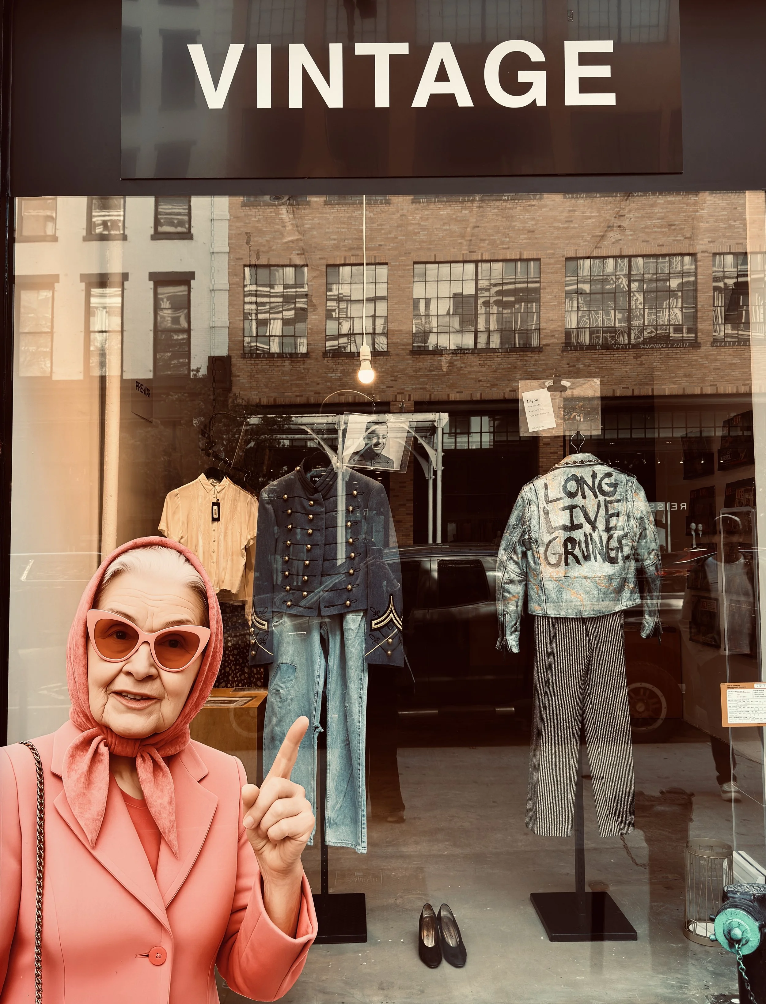
Not everything I photograph in New York is necessarily what I would call “beautiful” design in the traditional sense, or even something I would choose for my own work. But it might have character. It might have conviction. It might have a very strong voice.
And sometimes, I find that much more interesting.
I’m not trying to create a beautiful catalogue of branding in New York. I’m looking for the things that make me stop in the street for one reason or another. It might be something incredibly refined and considered, or it might be something slightly strange, unexpected or even imperfect — but with such a strong point of view that you can’t help but notice it.
“Good design doesn’t always have to be beautiful. It has
to make you feel something, or make you look twice.”
I think that’s probably what I’m always looking for, both when I’m travelling and when I’m working. A visual identity can be minimal, bold, playful, unconventional or incredibly simple. What matters is that there is an idea behind it, and that it feels intentional.
Ultimately, that’s what makes branding so fascinating to me. There are no fixed rules about what a brand should look like. There is an opportunity to create something with its own personality, its own visual language and its own reason for being.
And perhaps that’s why I keep photographing it.
If you’re looking to develop a visual identity with a similarly curious and considered approach, discover our brand identity work.
By Clementine, Founder, Brand Designer, Photographer - MÚSE Creative Studio

About the author
Clementine is founder and Creative Director of MÚSE Creative Studio, a Brighton-based brand design and digital marketing studio for independent brands. With a background in photography, art direction and designer womenswear and kidswear, rooted in Paris, based in Brighton, she brings a considered creative eye to every project, creating visual identities that feel intentional, distinctive and built to last.